United States
2024
The Journey of Creating the Unified Design System
FROM CHAOS TO CLARITY
Company overview
Rippling is a SAAS company that provides an integrated platform for managing various HR, IT and finance functions. Founded in 2016 and headquartered in San Francisco. Rippling offers solutions that streamline employee onboarding, payroll, benefits administration, and IT management. The platform aims to simplify complex business operations by consolidating these features into a single, unified system. The company serves a wide range of businesses, from small startups to larger enterprises.
Rippling employs over 1,000 engineers and 40+ product designers who are daily consumers of the design system.

1.0

This case study explores the design and development of the UI design system for Rippling. The objective was to create a cohesive, scalable, accessible and user-friendly design system that enhances user experience and ensures consistency across all Rippling products (apps).
Intro

Rippling now has a headcount of over 1,000 in R&D, organized into 14 distinct product verticals. It felt like a collection of entirely different products (or apps) under one roof.
Rippling R&D feels like a chaos
Creating and maintaining a design system for such a diverse set of apps is highly challenging. Each app has unique requirements, making it tough to ensure consistent design patterns across the board.
How to make 20 vastly diverse apps feel like a single cohesive product?
Each team is dedicated to delivering the best user experience in its domain, competing fiercely with rivals to attract new customers. However, this often results in inconsistent design patterns across different apps, as product teams tailor their UIs to appeal to users familiar with competing platforms.
The challenge lies in balancing the unique requirements of each app while maintaining a cohesive visual and functional experience. The system must be adaptable to new features without compromising the overall user experience.
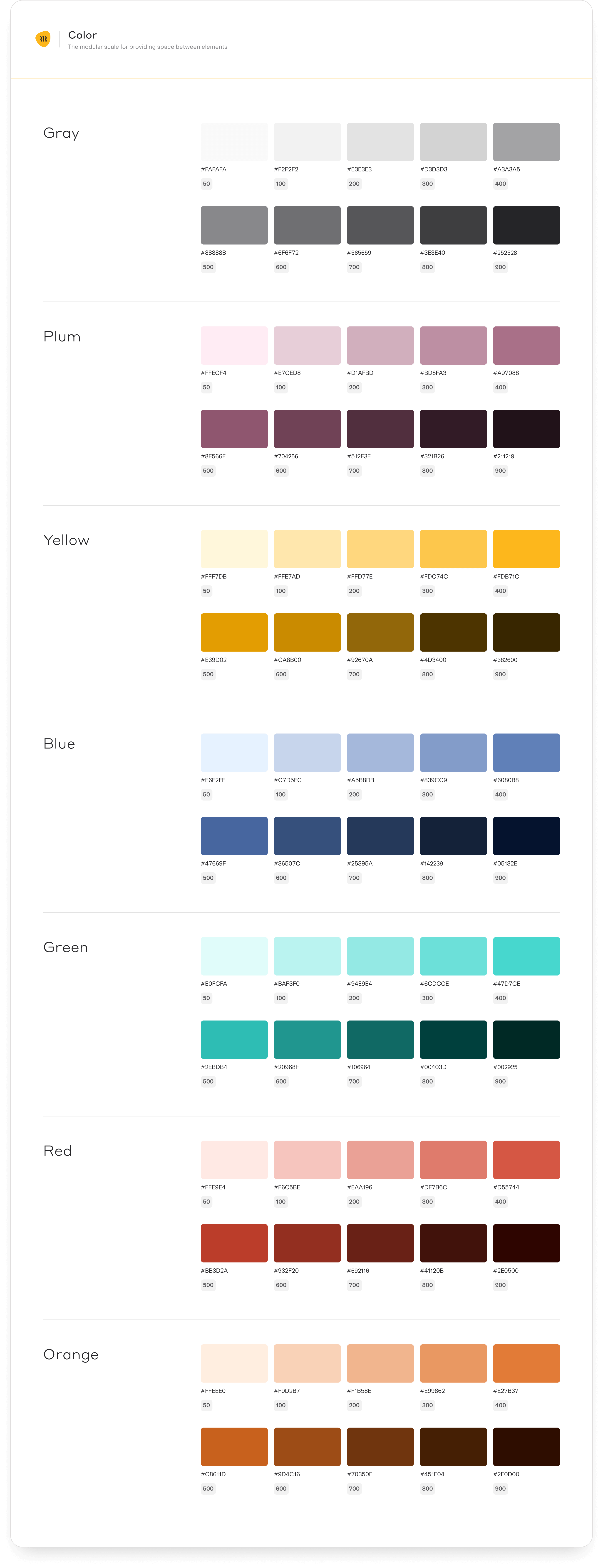
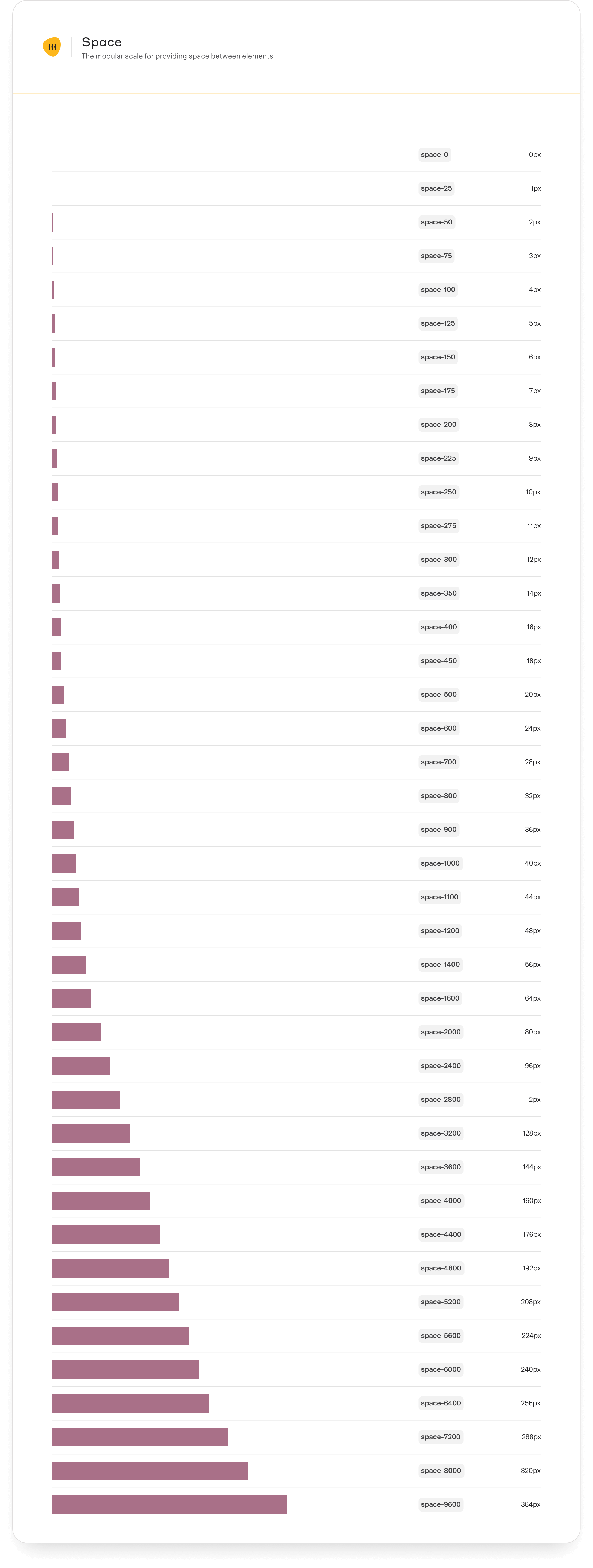
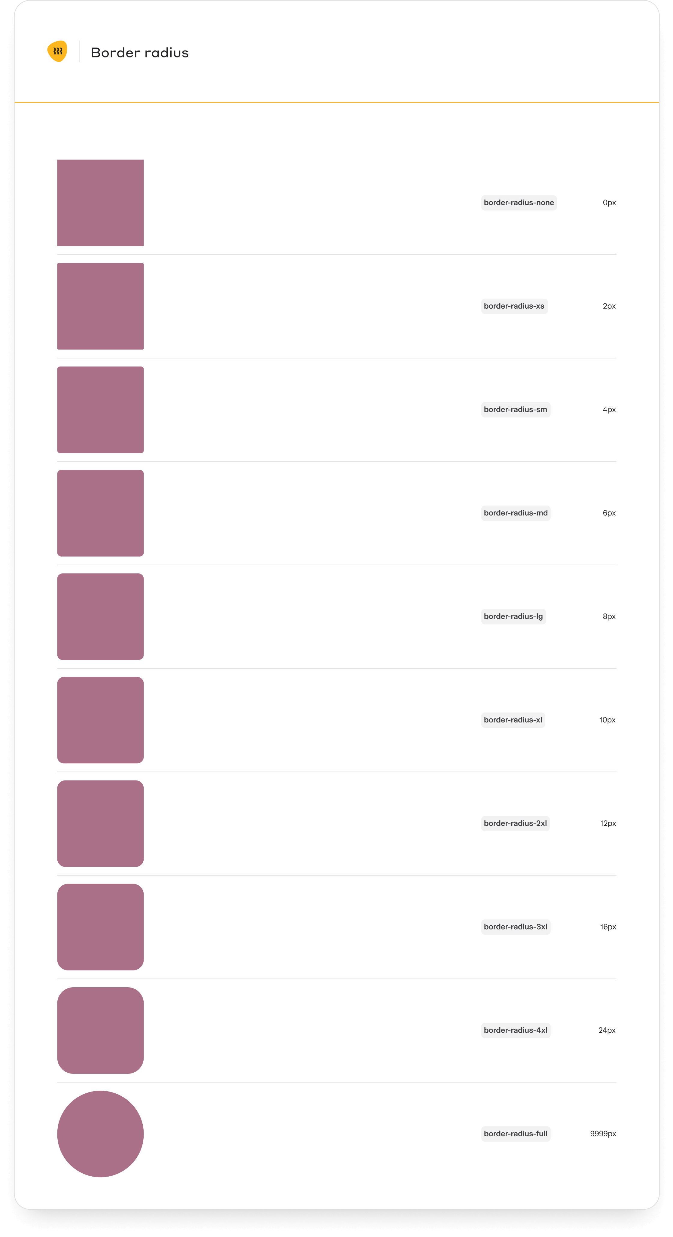
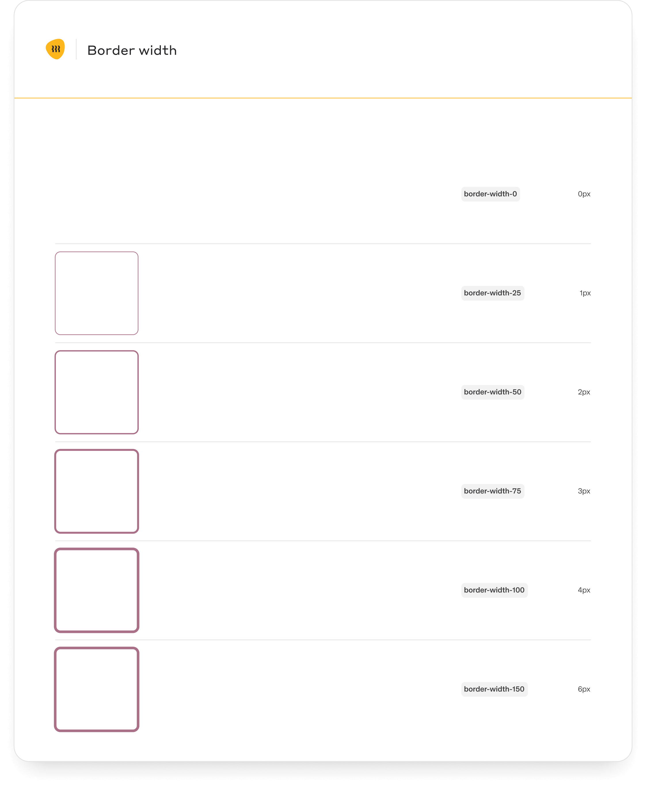
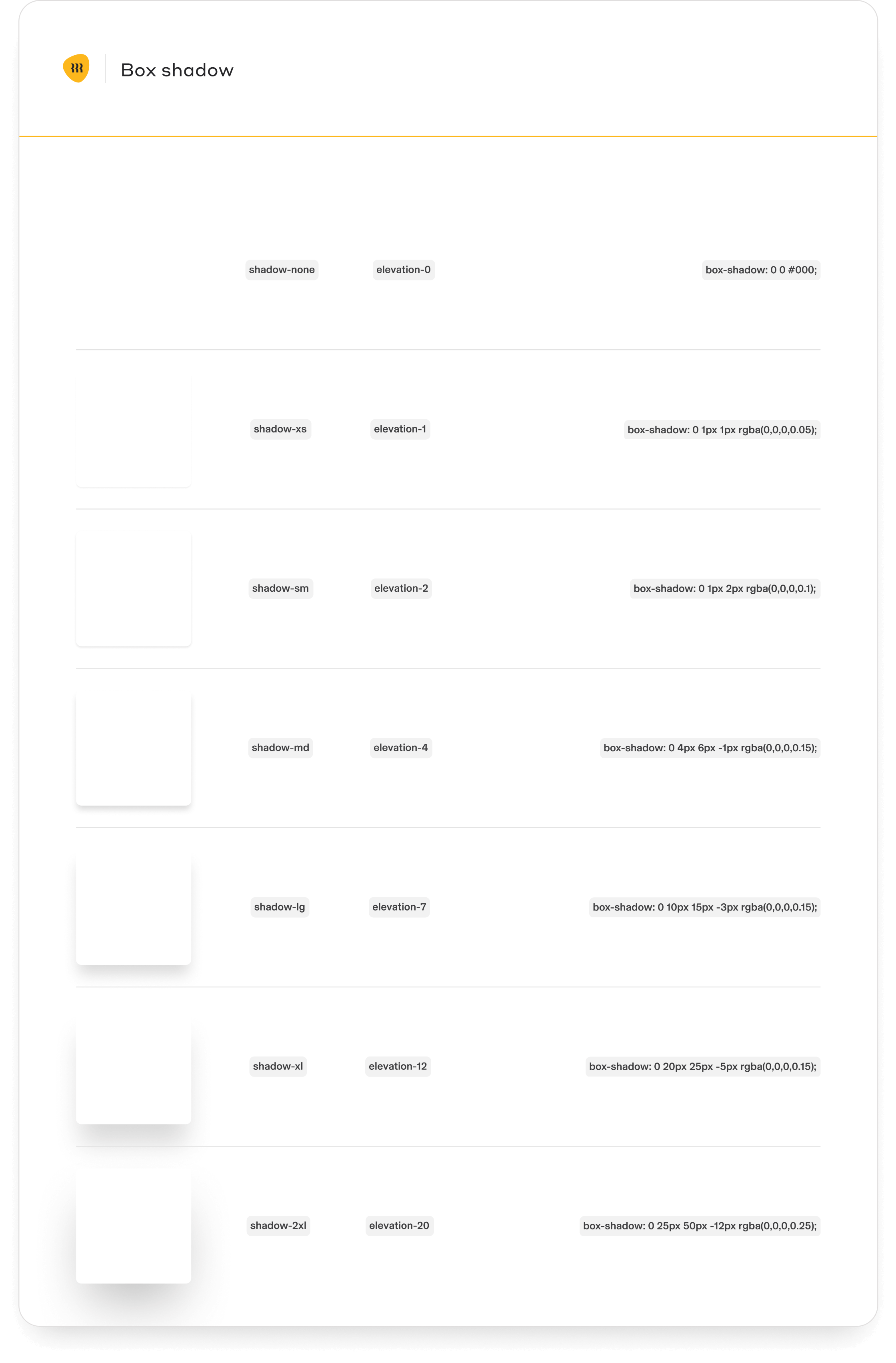
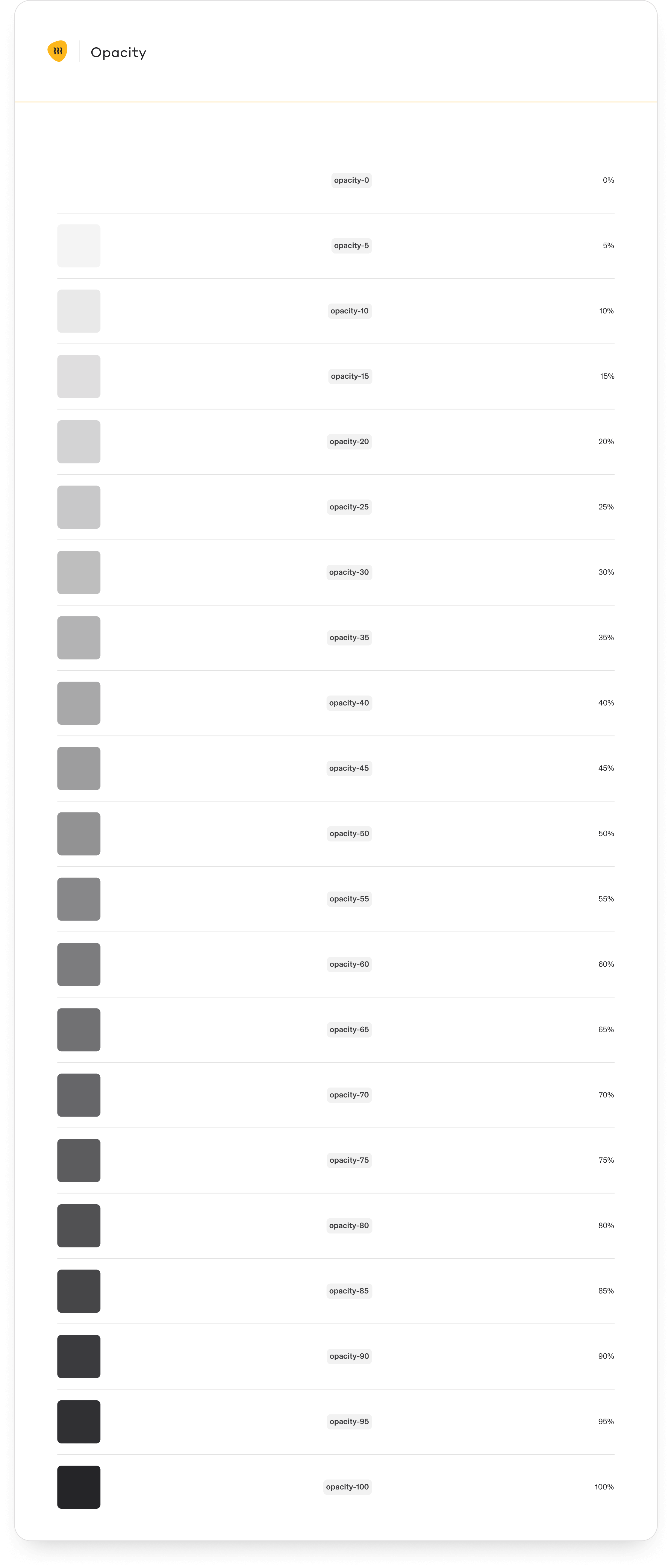
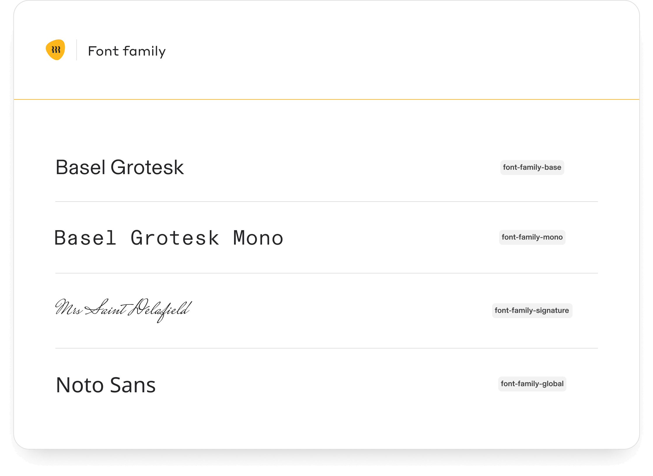
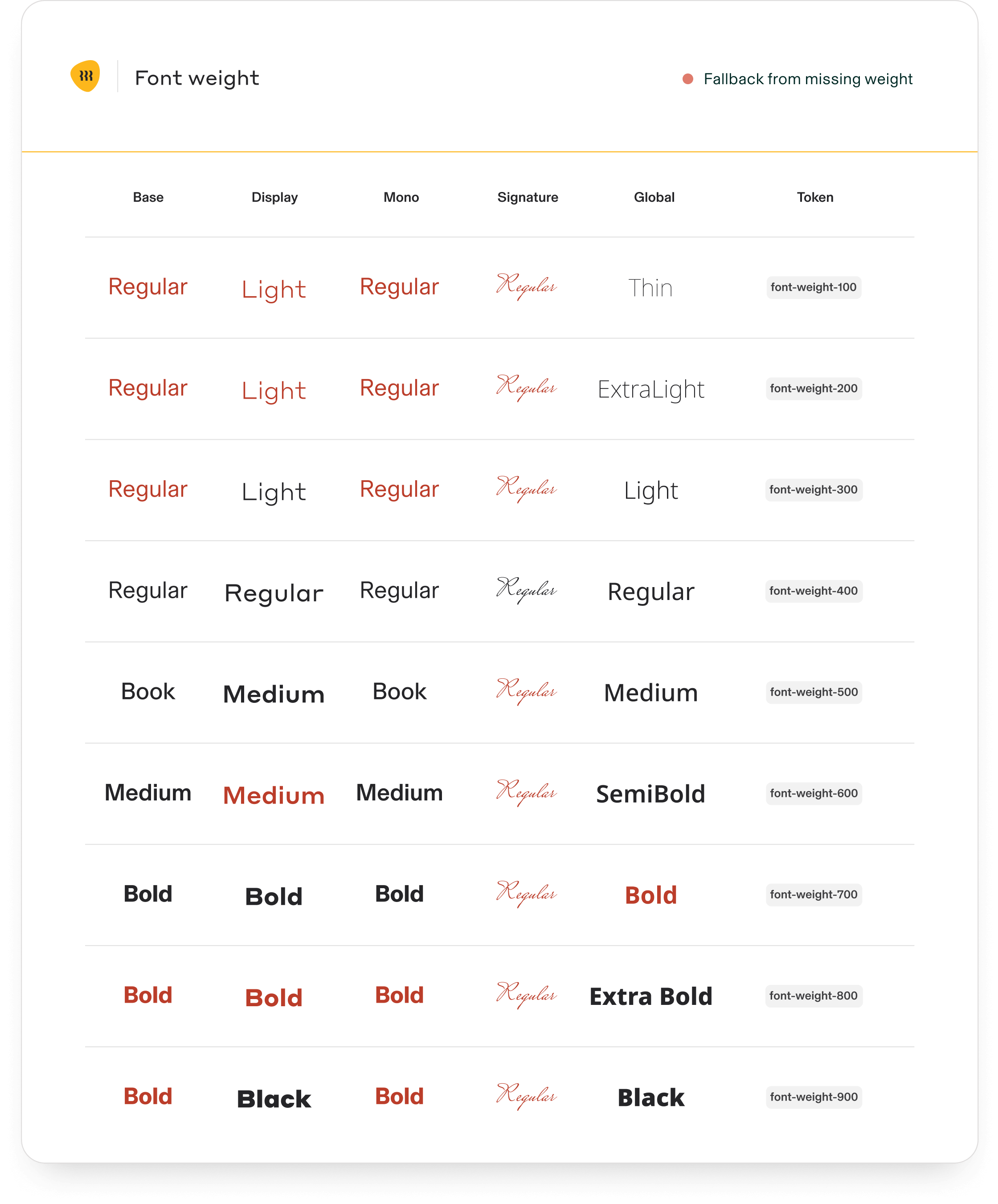
Core tokens
The documentation provides essential guidelines for using and maintaining the components effectively.
Component library documentation and usage guidelines

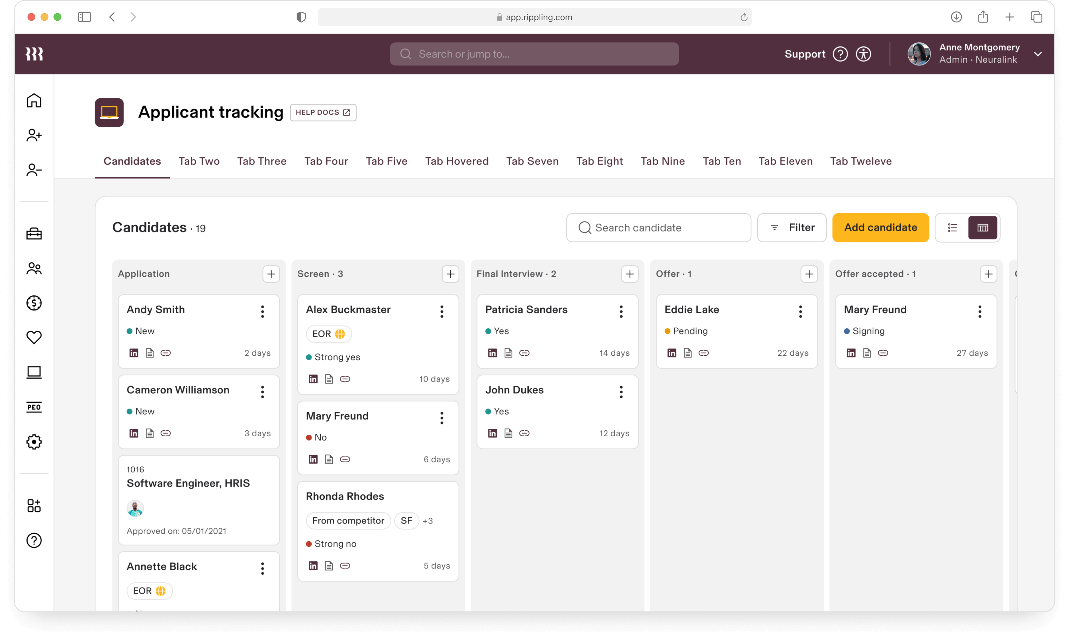
The complexity of a Kanban board as a design system component lies in balancing robust functionality with ease of use. It supports features like task visualization, customization, and automation while ensuring a seamless, responsive experience across devices.
Integration with other tools through APIs and maintaining accessibility further add to its intricacy, requiring thoughtful design to ensure performance and reliability.
Integration with other tools through APIs and maintaining accessibility further add to its intricacy, requiring thoughtful design to ensure performance and reliability.
Kanban board
Monster components


