United States
2024
The Journey of Creating the Unified Design System
FROM CHAOS TO CLARITY
Company overview
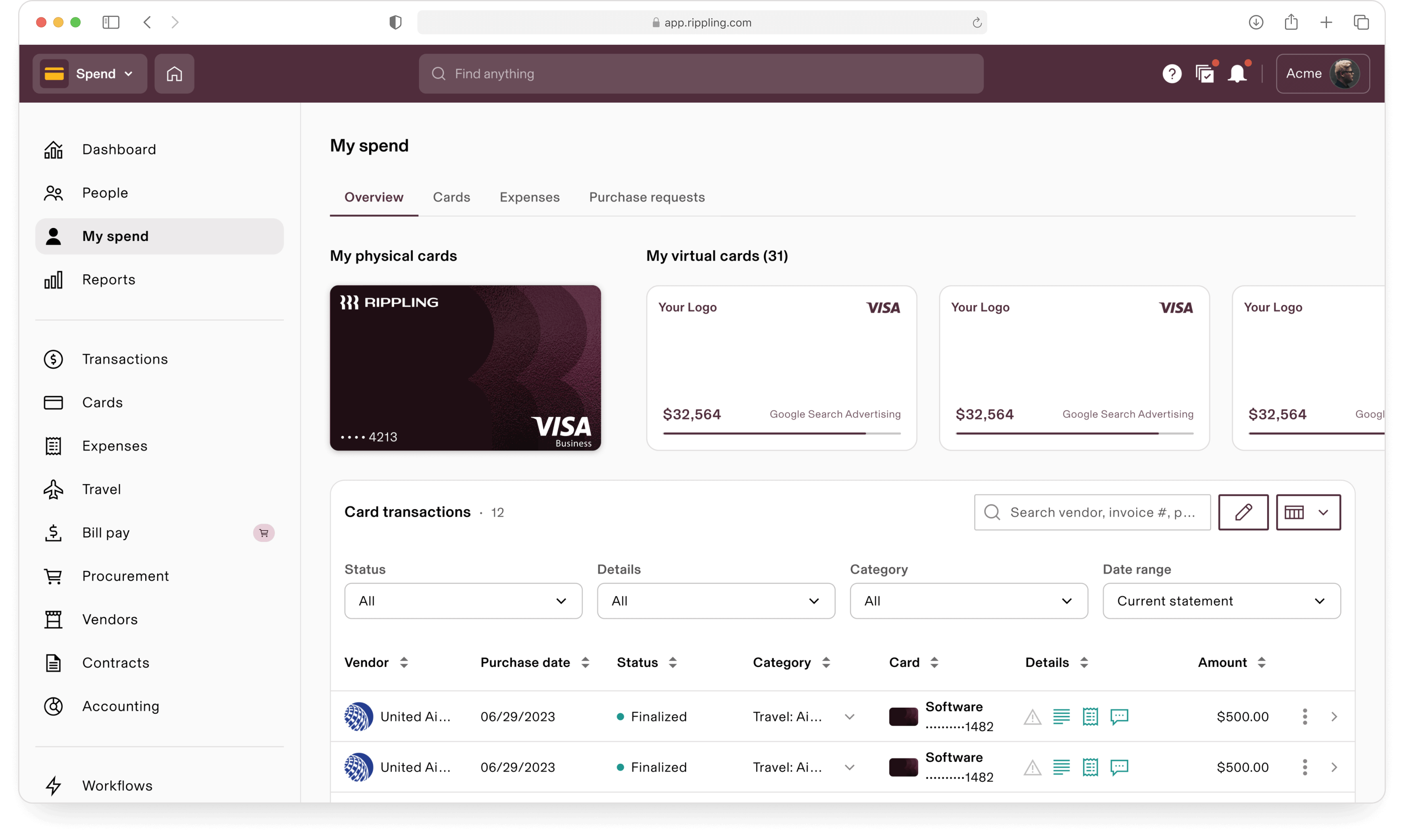
Rippling is a SAAS company that provides an integrated platform for managing various HR, IT and finance functions. Founded in 2016 and headquartered in San Francisco. Rippling offers solutions that streamline employee onboarding, payroll, benefits administration, and IT management. The platform aims to simplify complex business operations by consolidating these features into a single, unified system. The company serves a wide range of businesses, from small startups to larger enterprises.
Rippling employs over 1,000 engineers and 40+ product designers who are daily consumers of the design system.

1.0

This case study explores the design and development of the UI design system for Rippling. The objective was to create a cohesive, scalable, accessible and user-friendly design system that enhances user experience and ensures consistency across all Rippling products (apps).
Intro

Rippling now has a headcount of over 1,000 in R&D, organized into 14 distinct product verticals. It felt like a collection of entirely different products (or apps) under one roof.
Rippling R&D feels like a chaos
Creating and maintaining a design system for such a diverse set of apps is highly challenging. Each app has unique requirements, making it tough to ensure consistent design patterns across the board.
How to make 20 vastly diverse apps feel like a single cohesive product?
Each team is dedicated to delivering the best user experience in its domain, competing fiercely with rivals to attract new customers. However, this often results in inconsistent design patterns across different apps, as product teams tailor their UIs to appeal to users familiar with competing platforms.
The challenge lies in balancing the unique requirements of each app while maintaining a cohesive visual and functional experience. The system must be adaptable to new features without compromising the overall user experience.
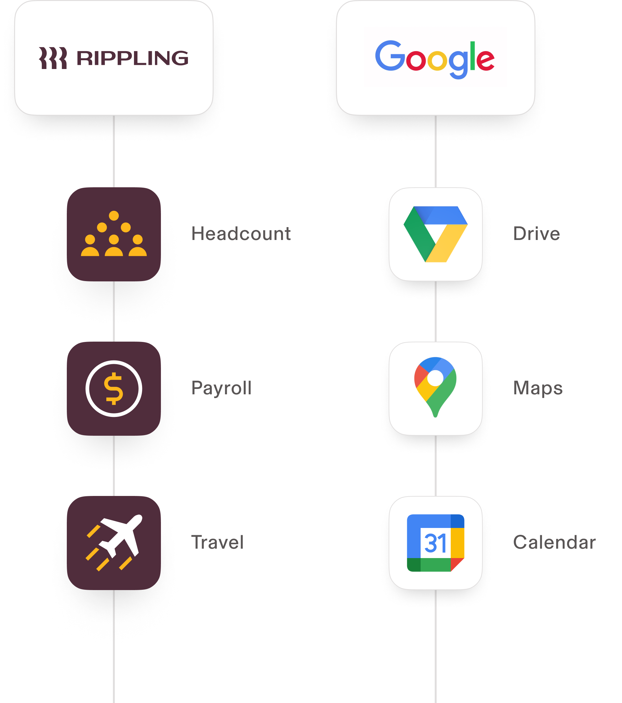
Drawing Parallels
A comparison of diverse yet unified Google and Rippling product suites
- Redesign all products simultaneously
- Develop a system that would satisfy all products
- Ensure consistency and flexibility across all products
- Unify the UI between web and mobile apps
- Improve design and engineering efficiency
- Streamline collaboration between designers and engineers
- Make the product WCAG AA accessibility compliant
Rippling is a leading provider of HR, IT and finance software. To support and sustain it’s rapid growth and diverse product offerings, the company needed a complete revamp of the design language and overall design boost. The goals were to:
Design system goals

The solution
2.0
Confidential | May 2023
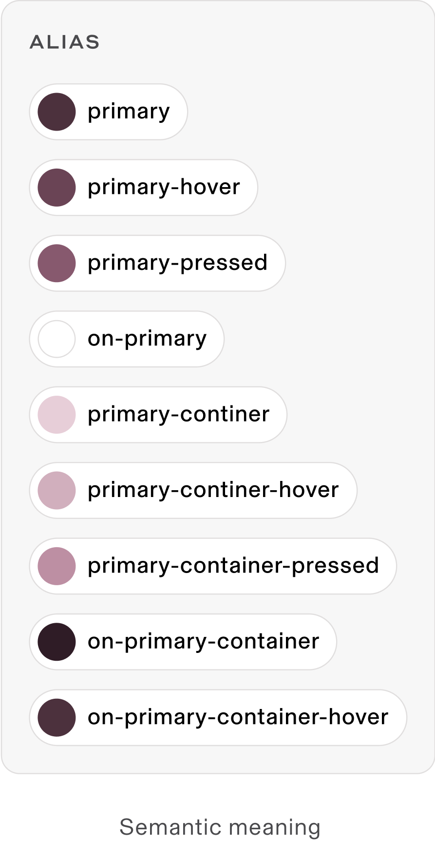
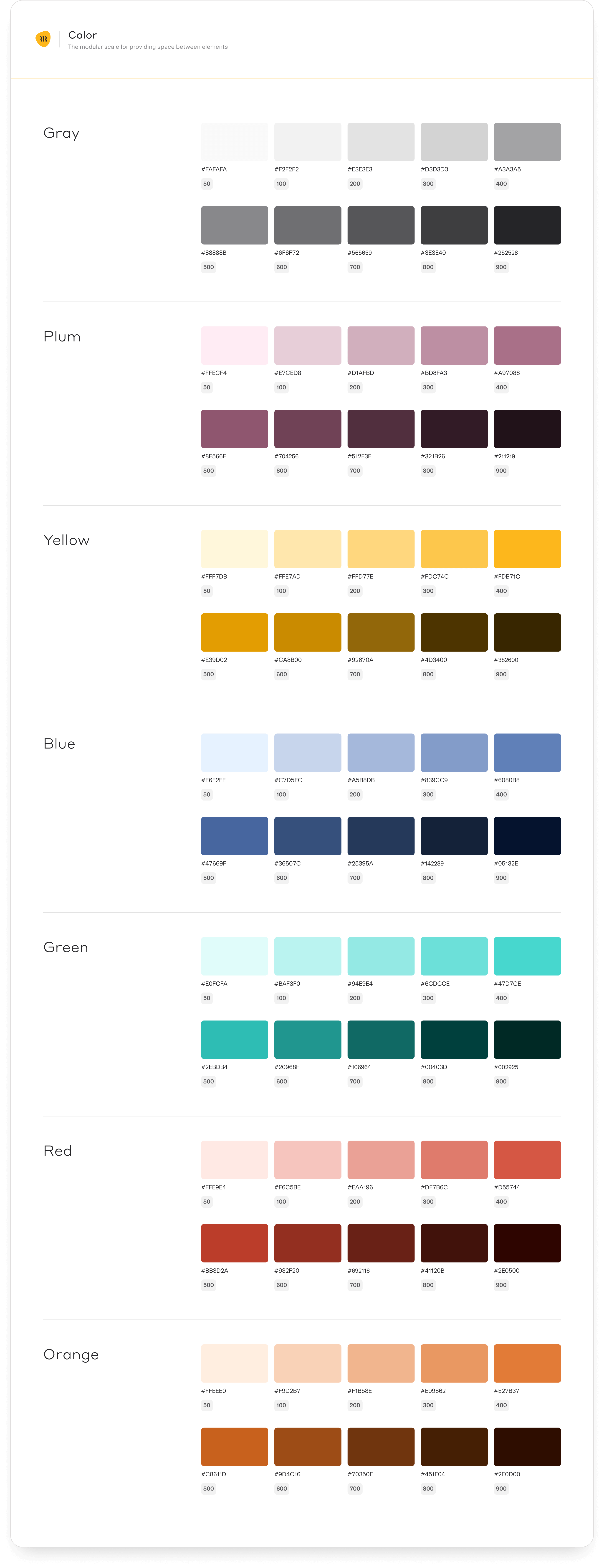
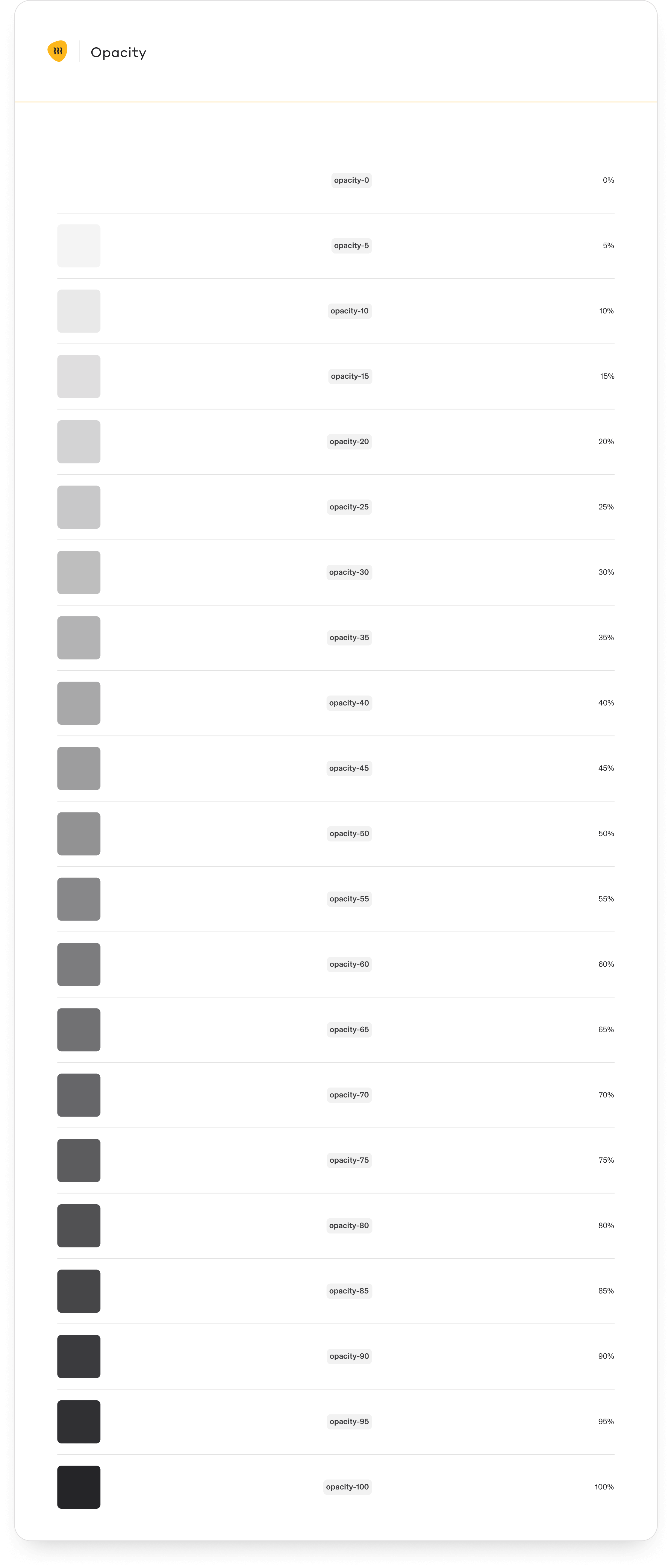
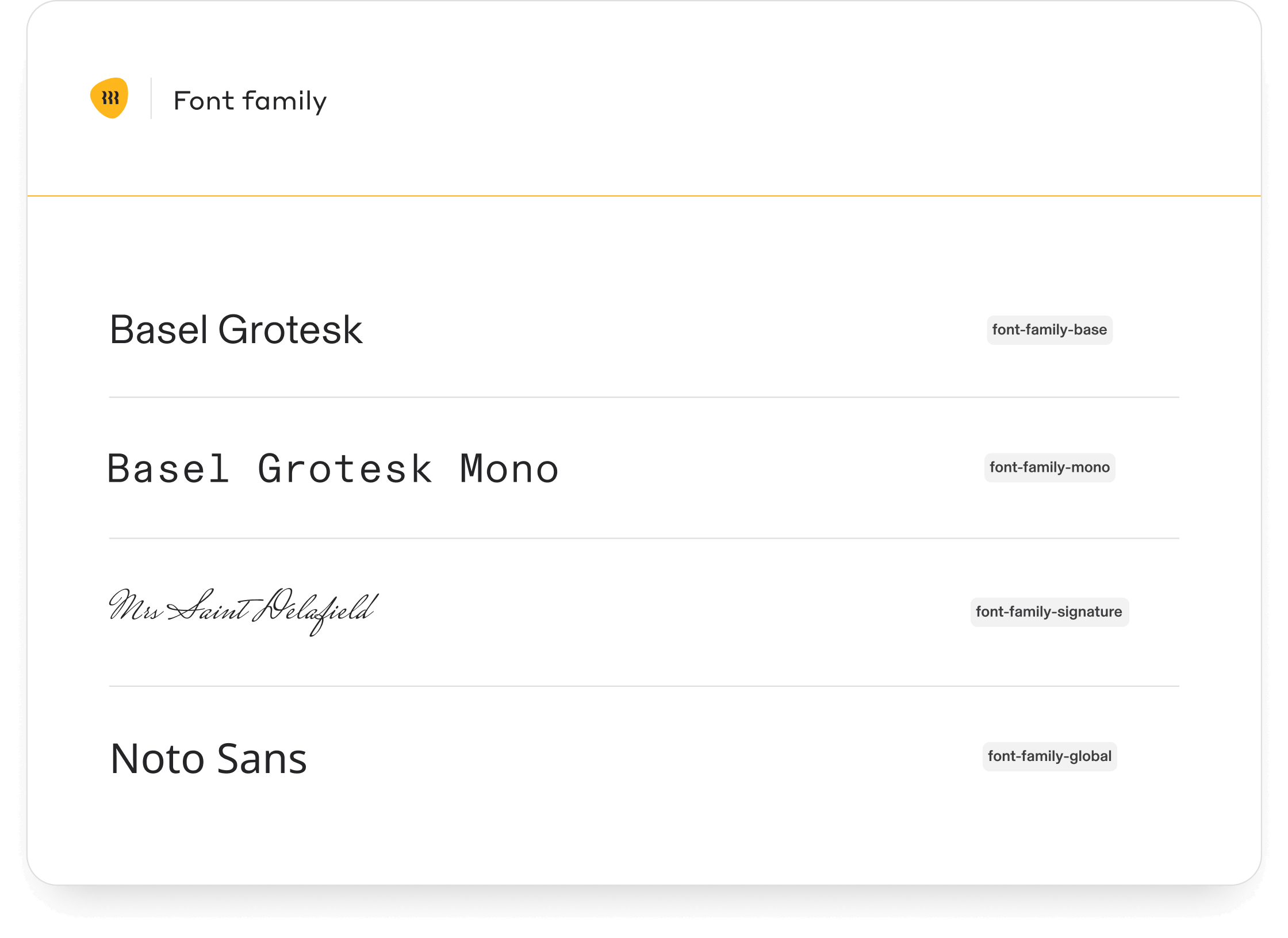
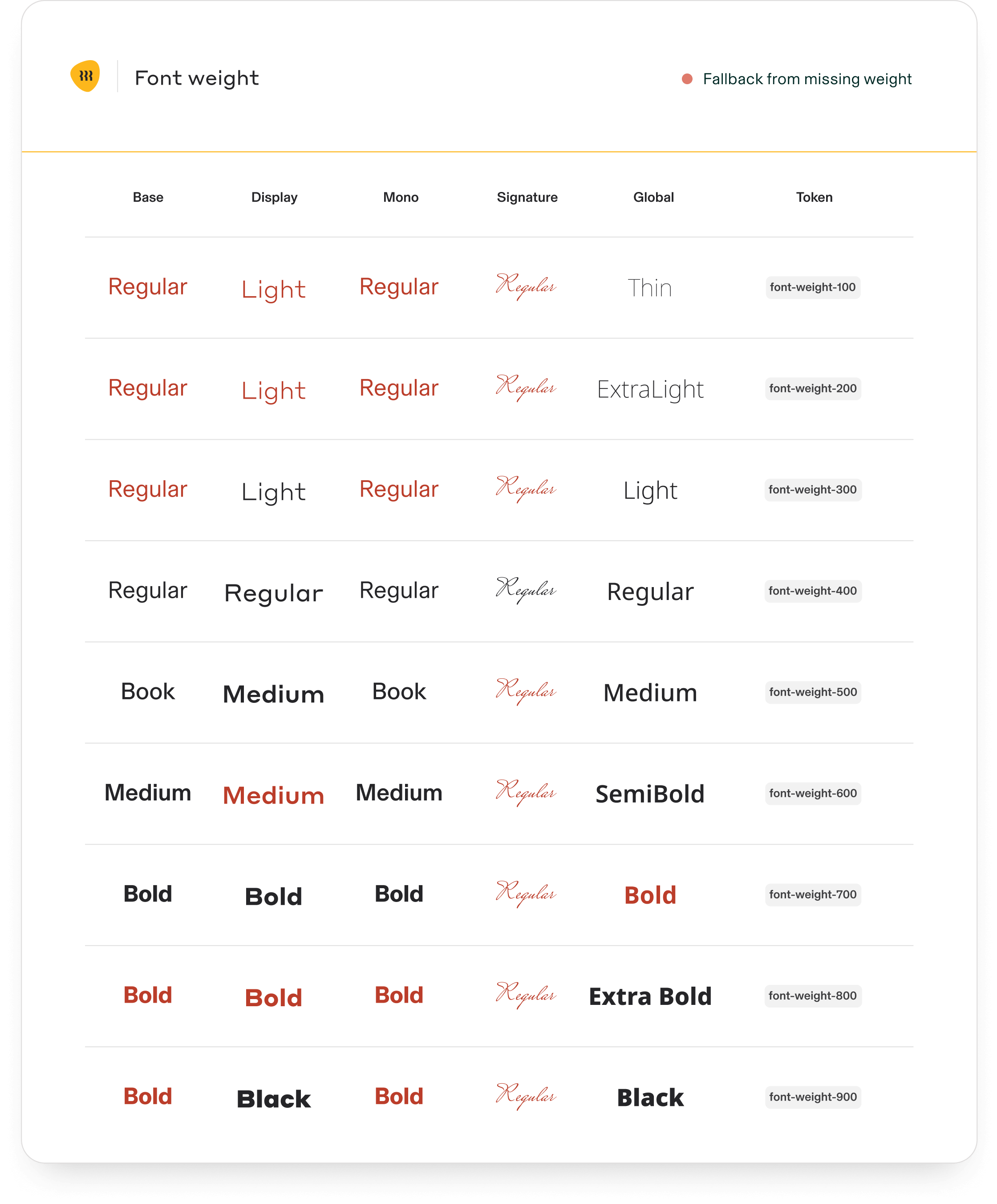
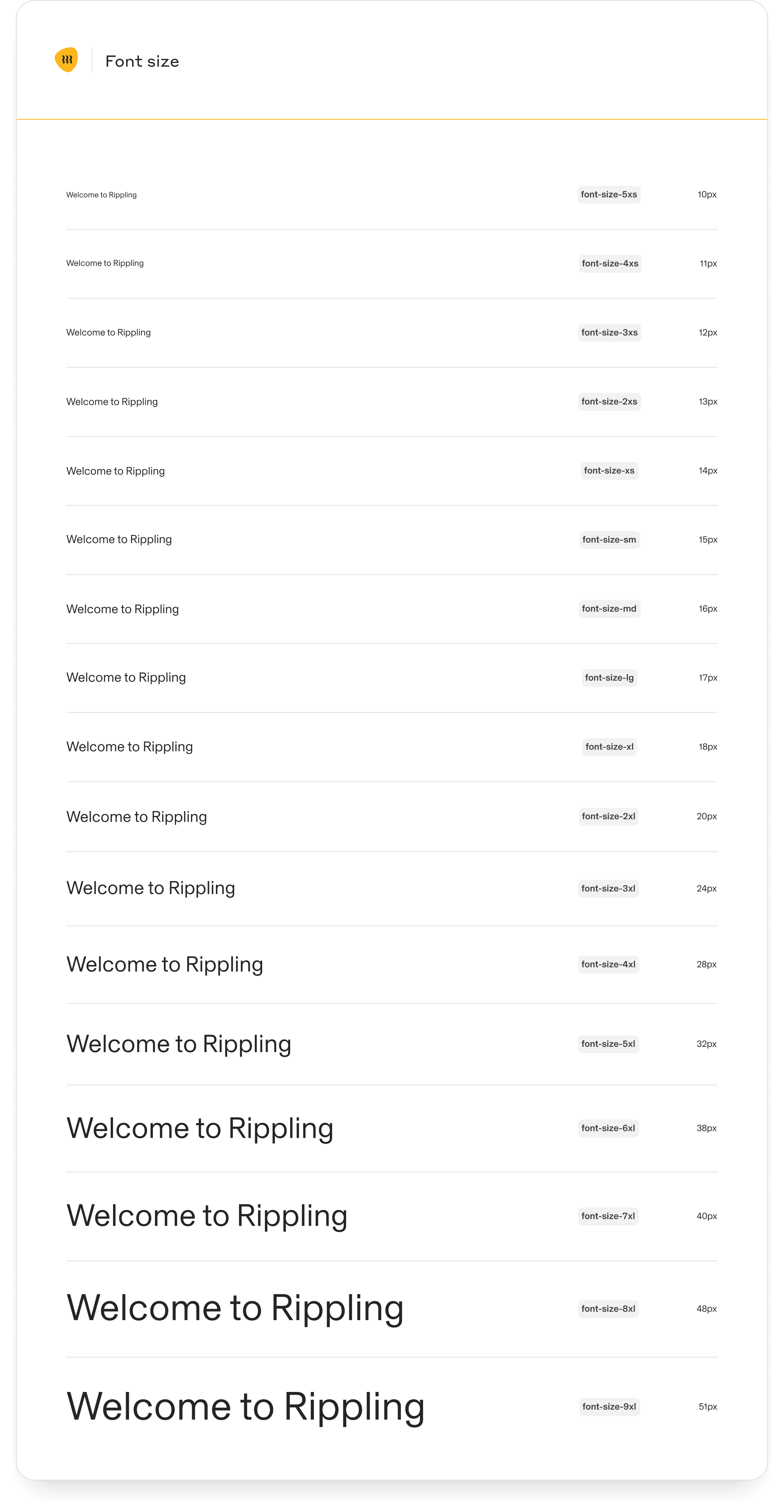
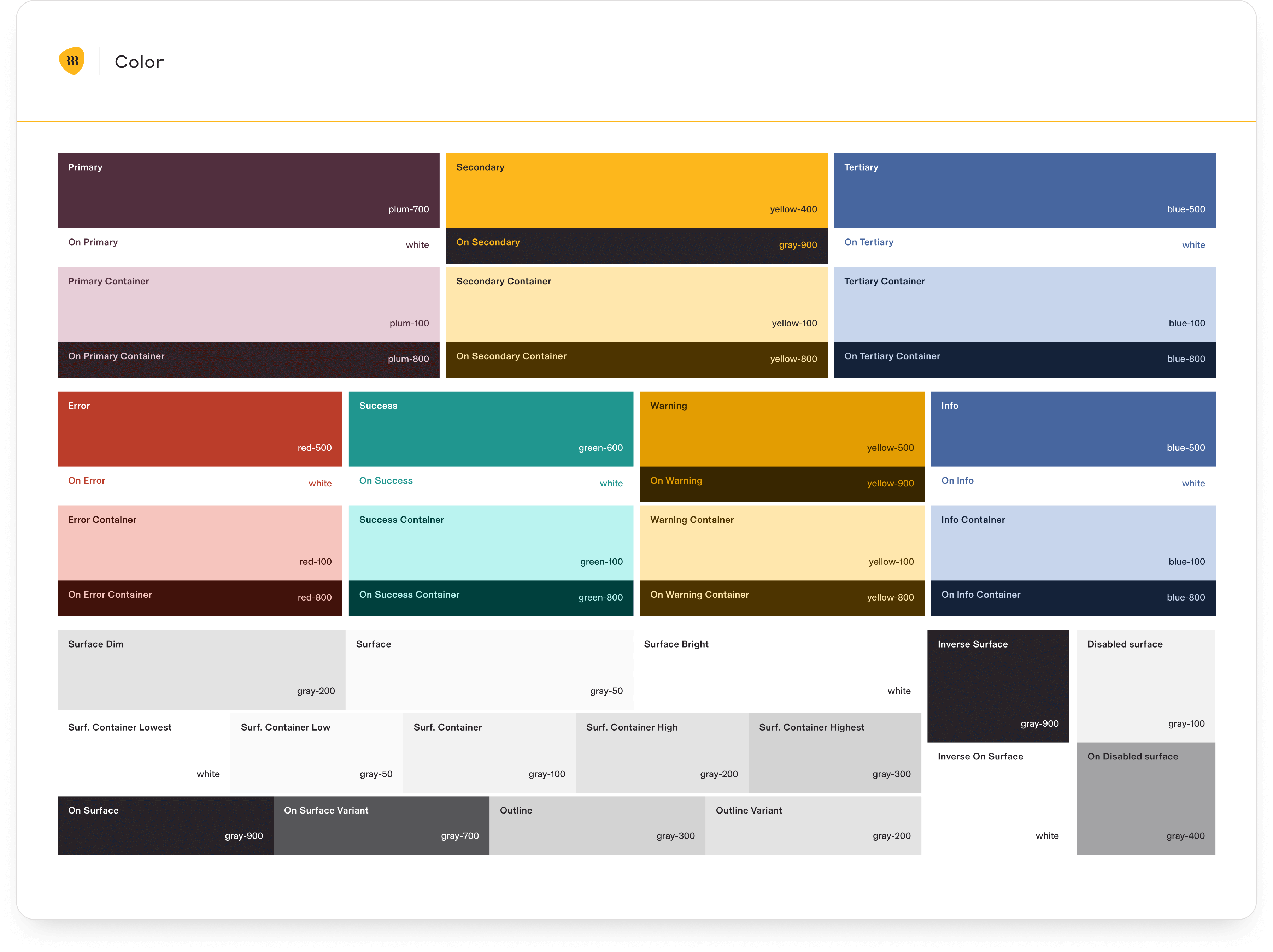
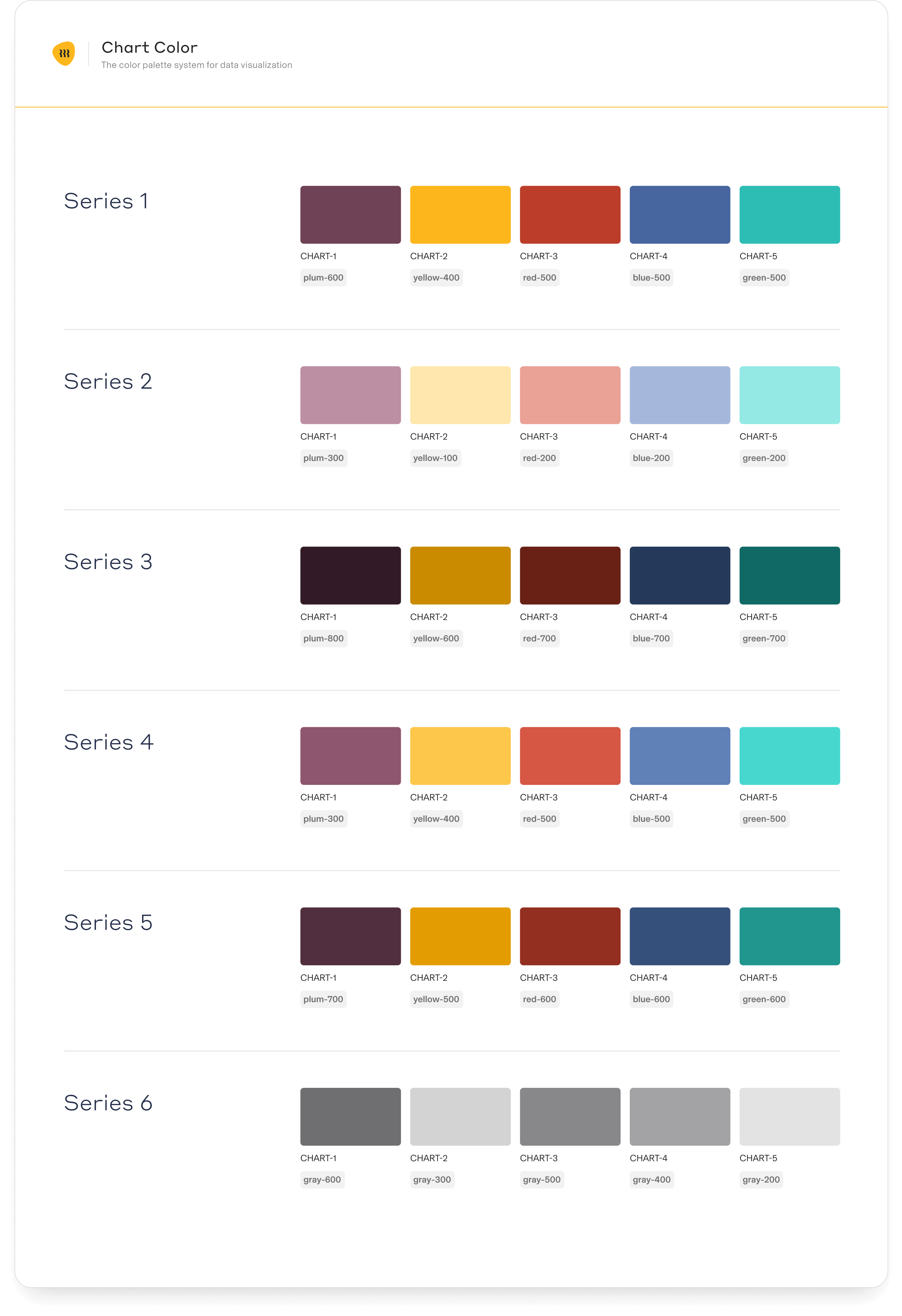
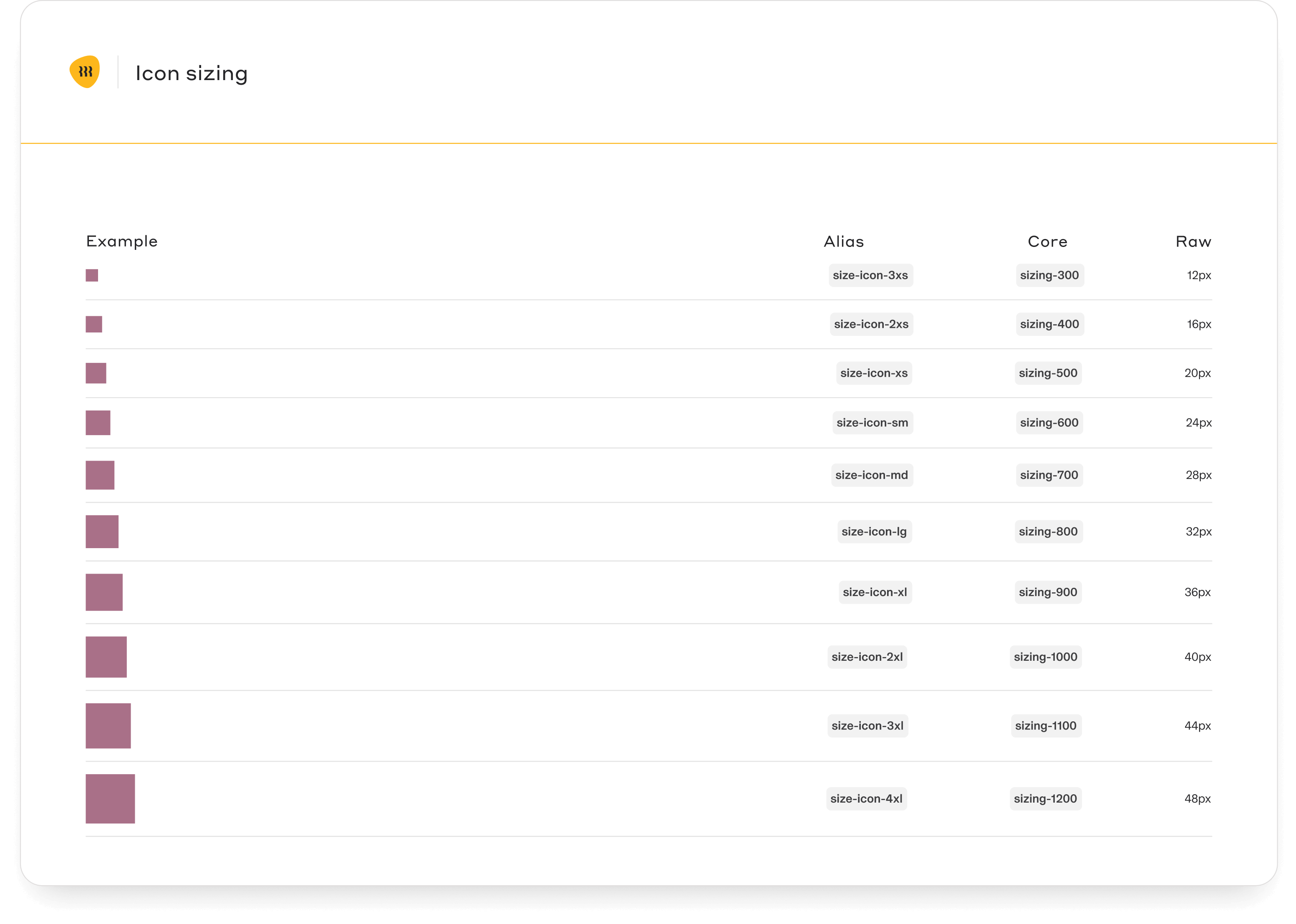
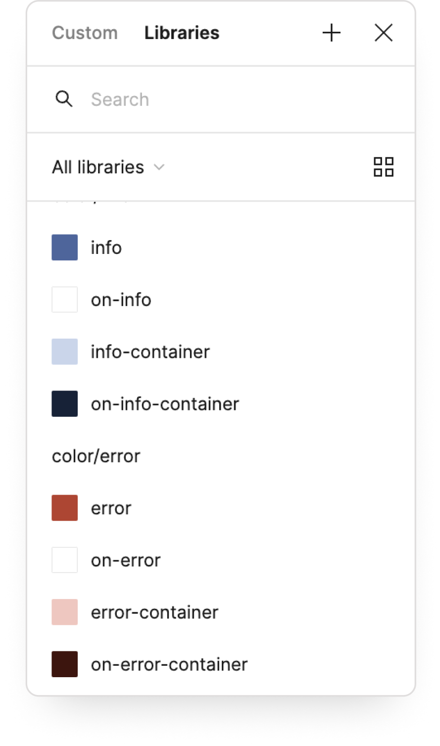
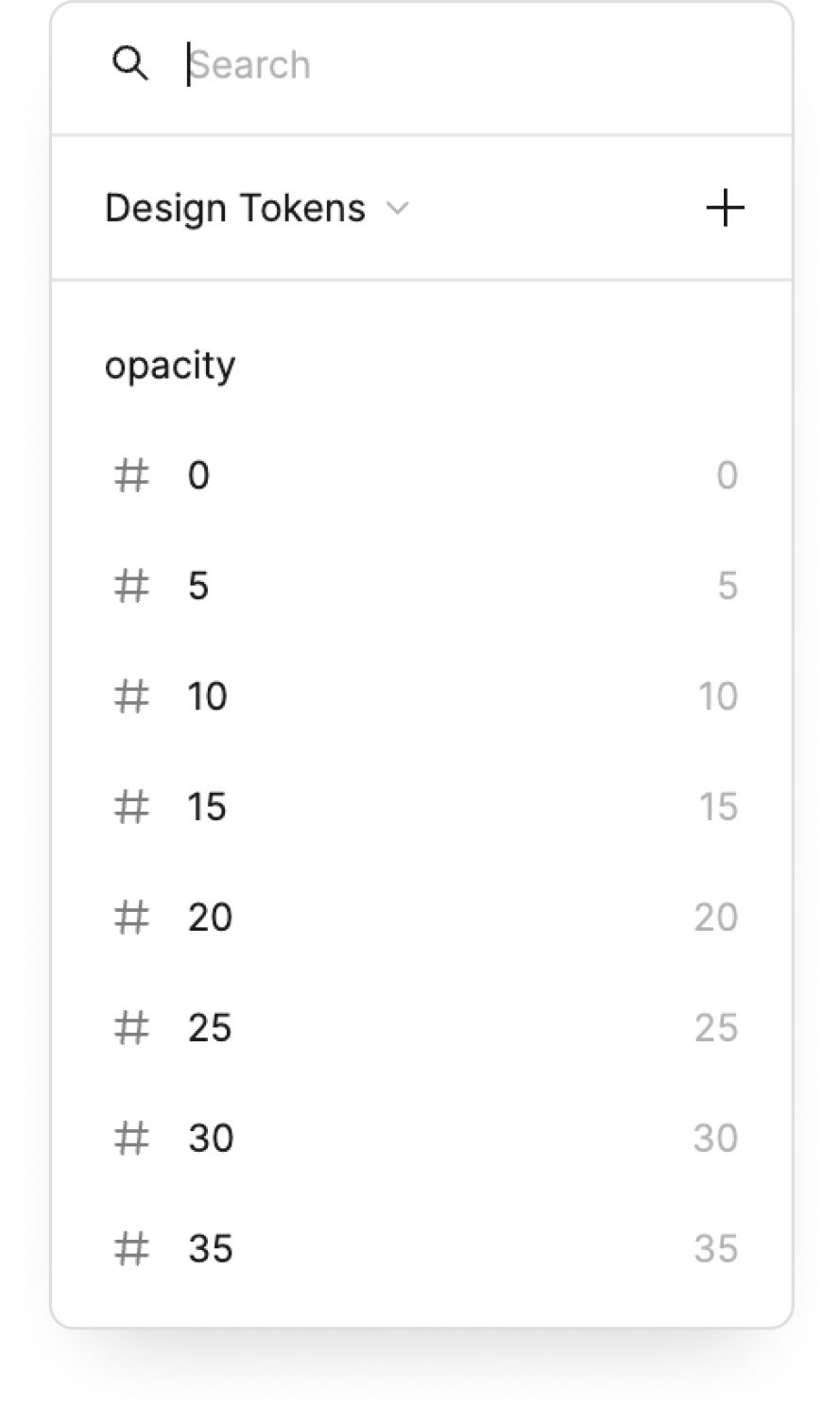
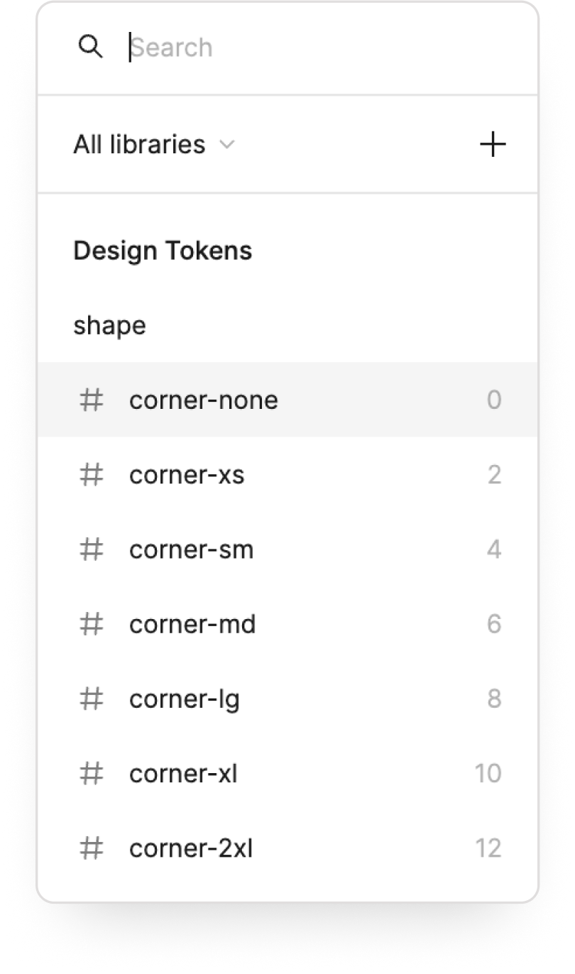
Tokens are the visual design atoms of the design system — specifically, they are named entities that store visual design attributes. We use them in place of hard-coded values (such as hex values for color or pixel values for spacing) in order to maintain a scalable and consistent visual system for UI design and development.
Design tokens
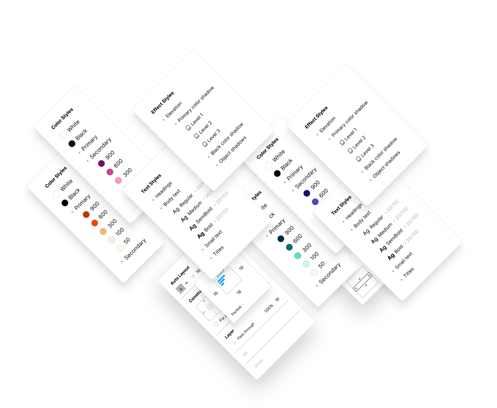
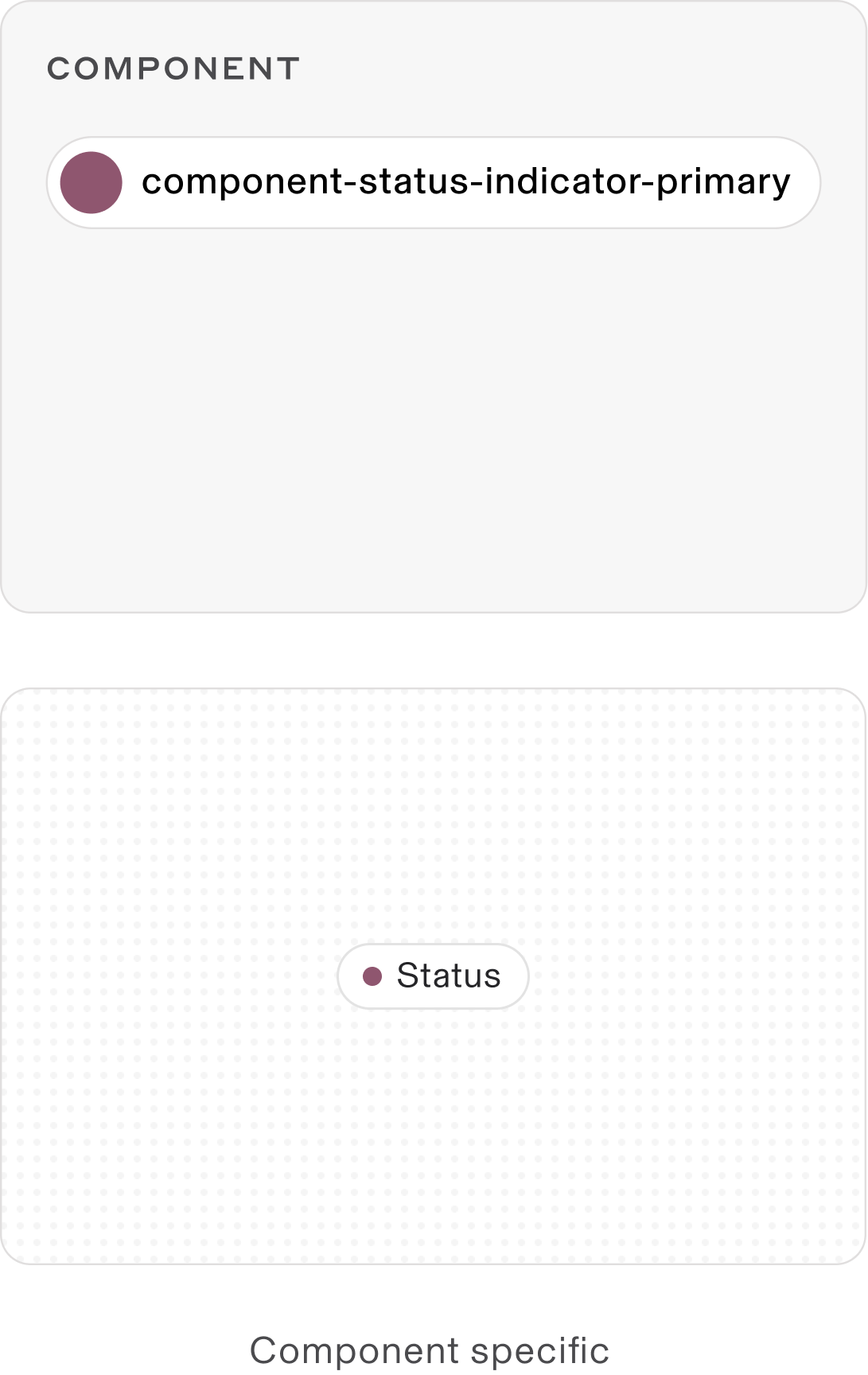
Tokens structure
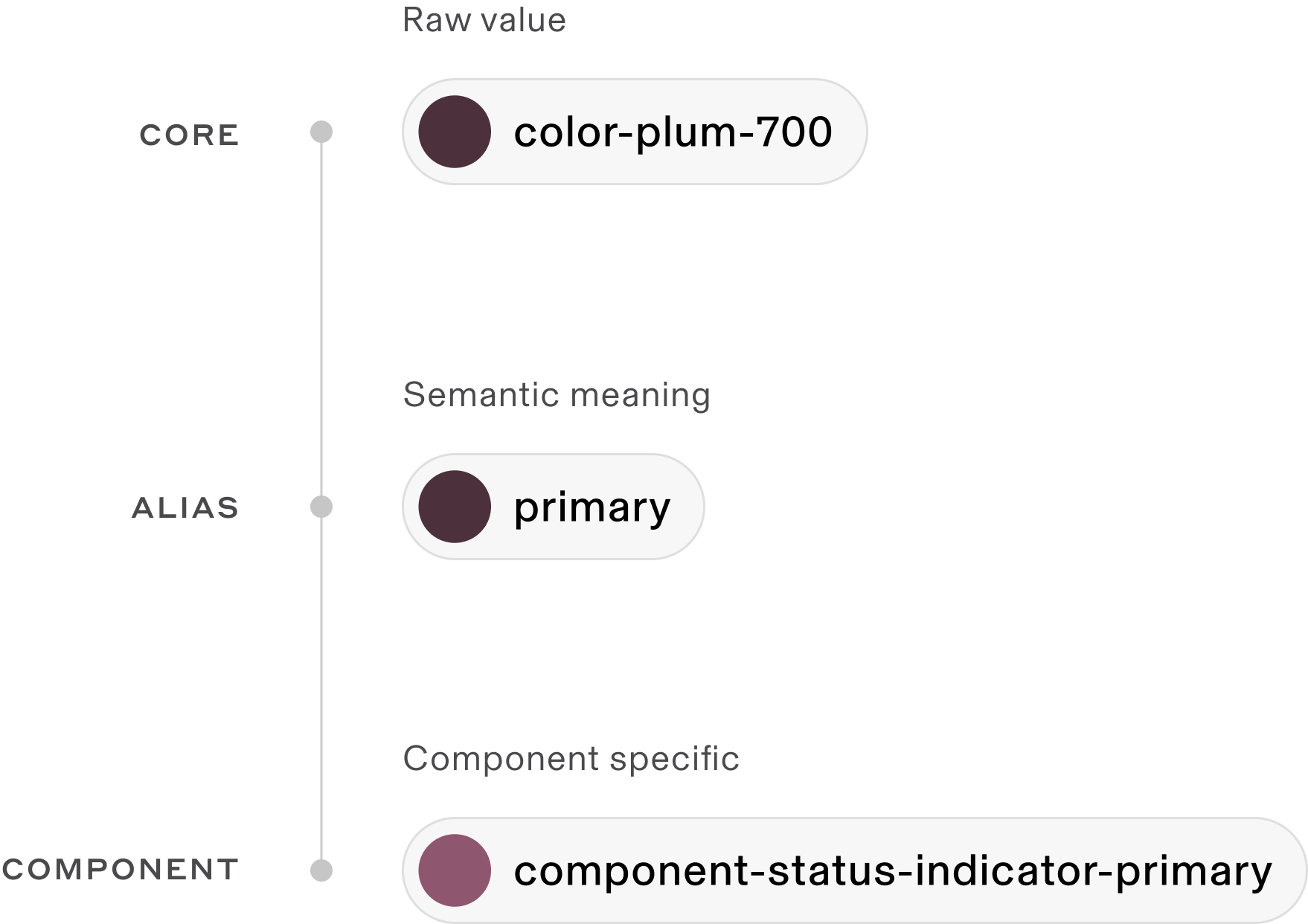
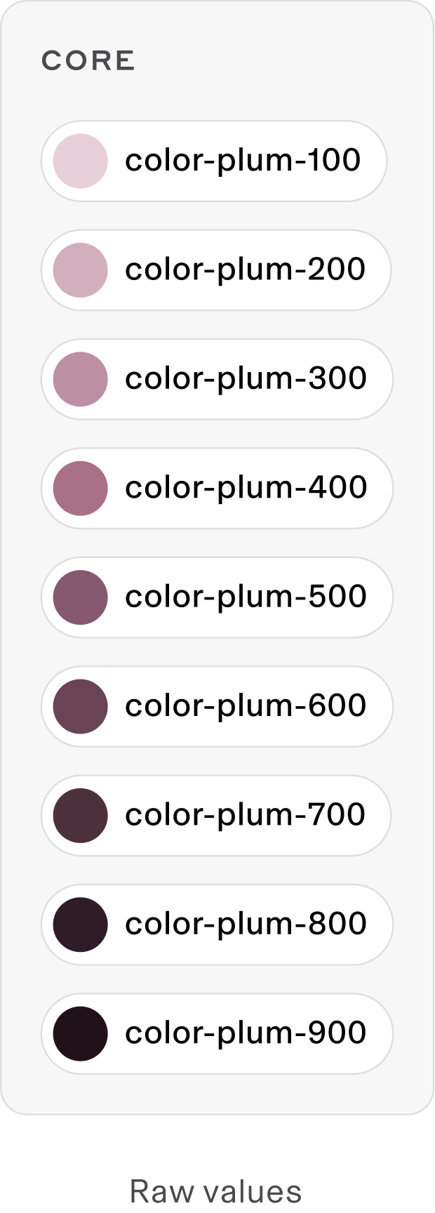
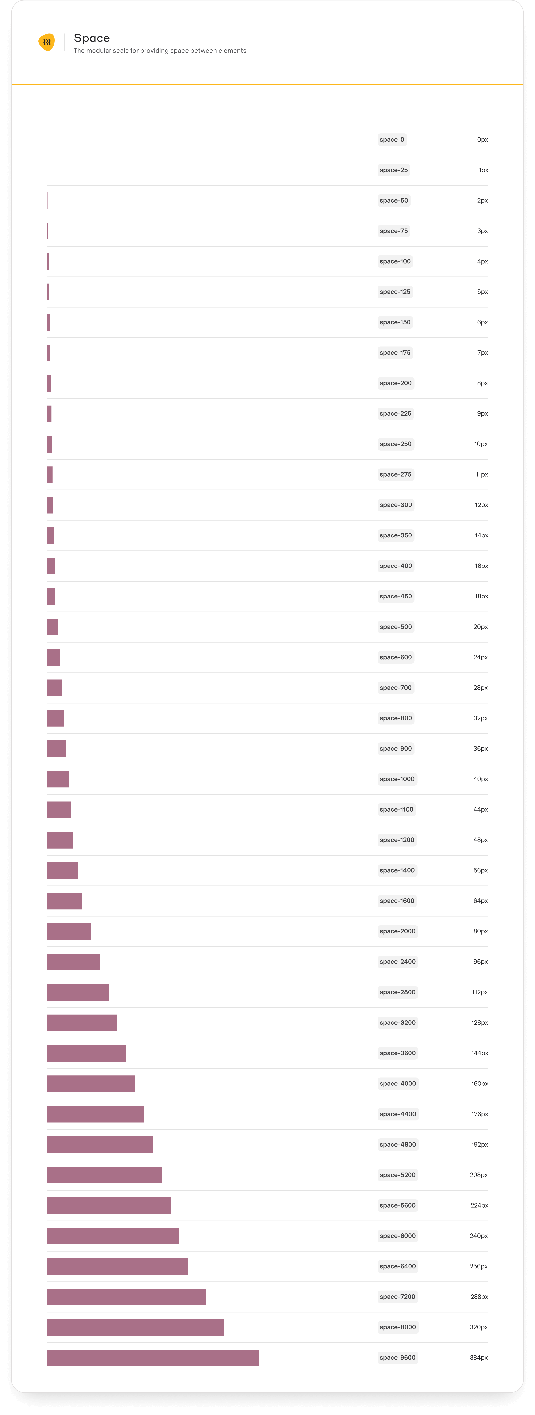
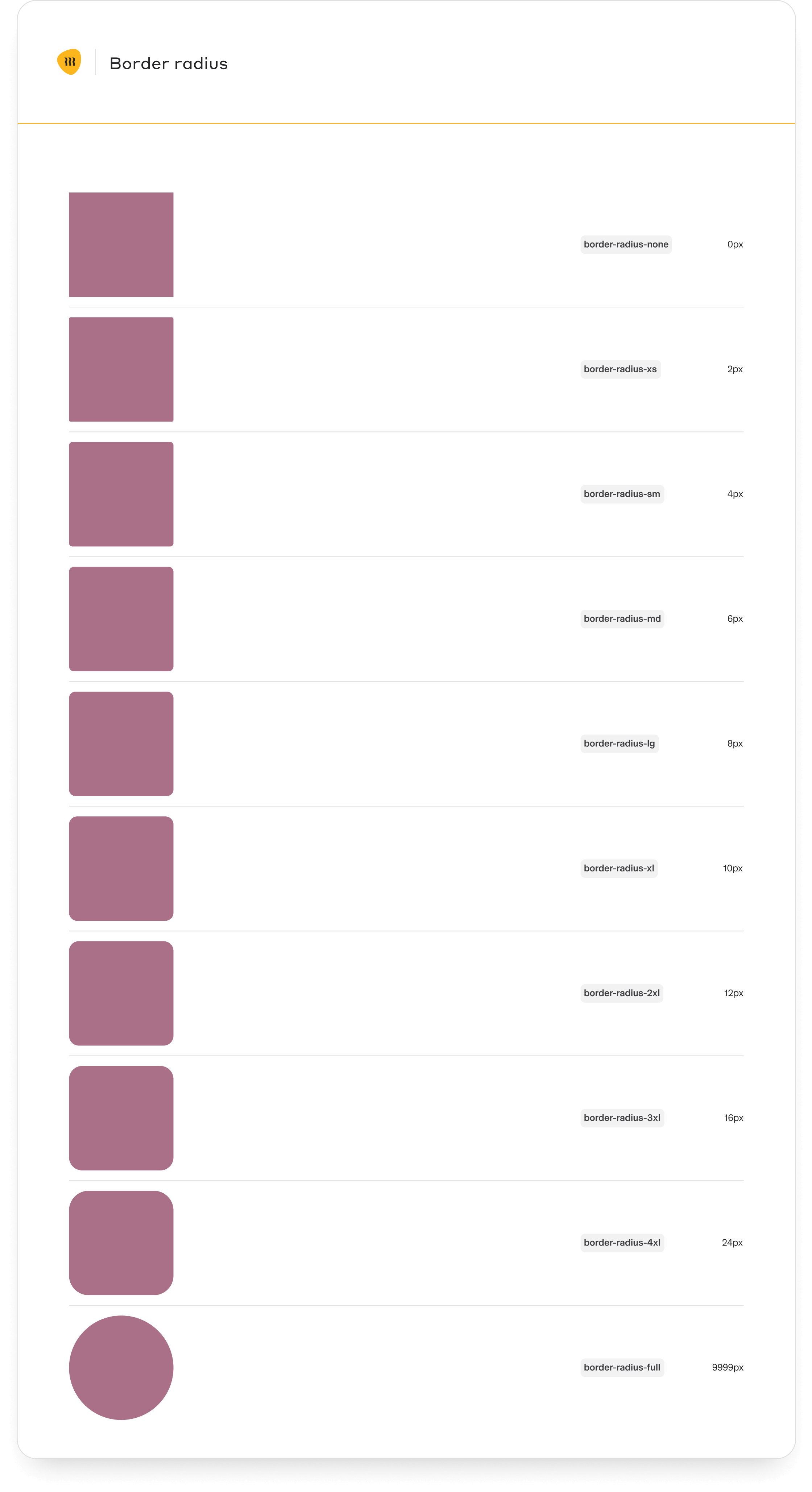
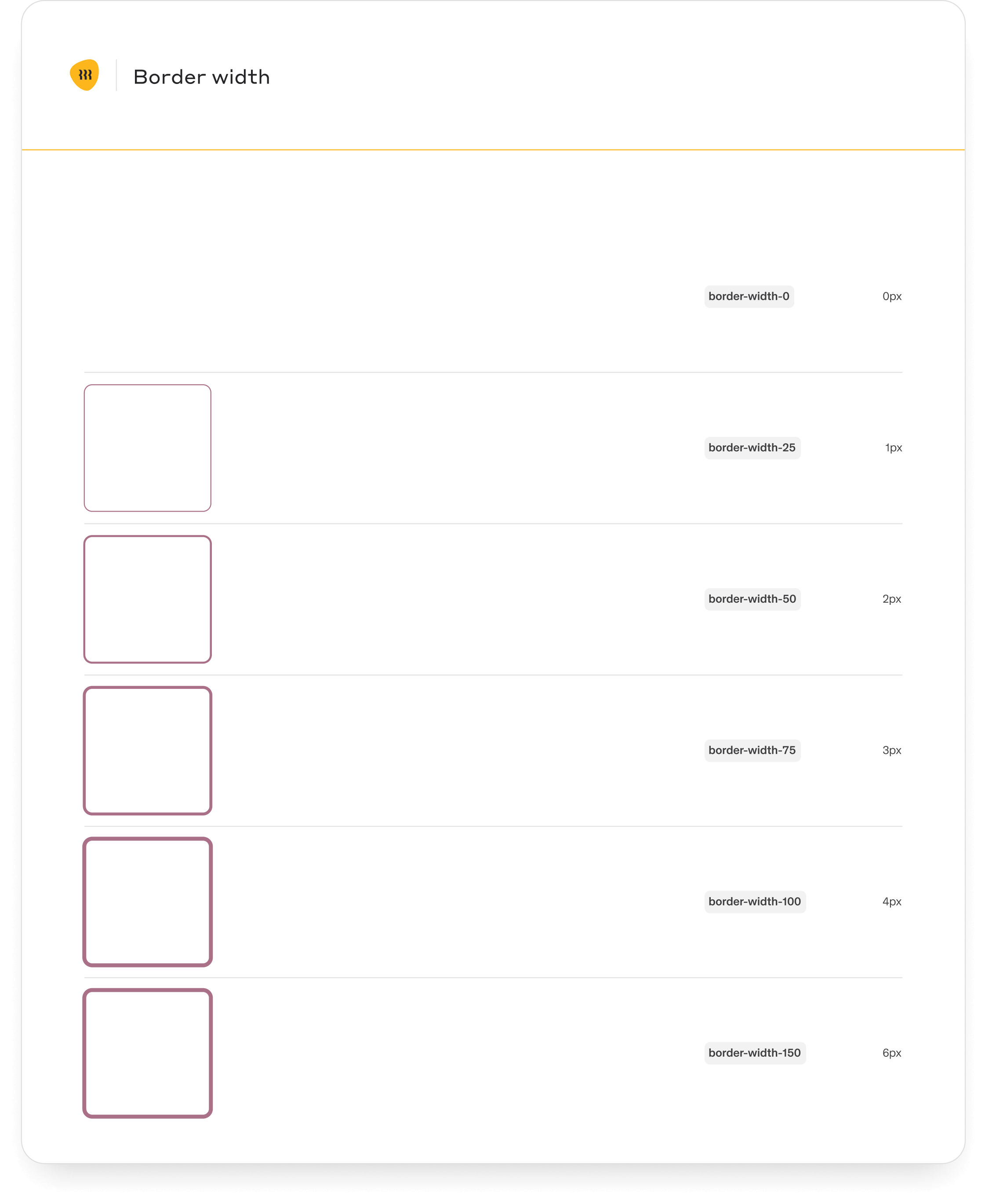
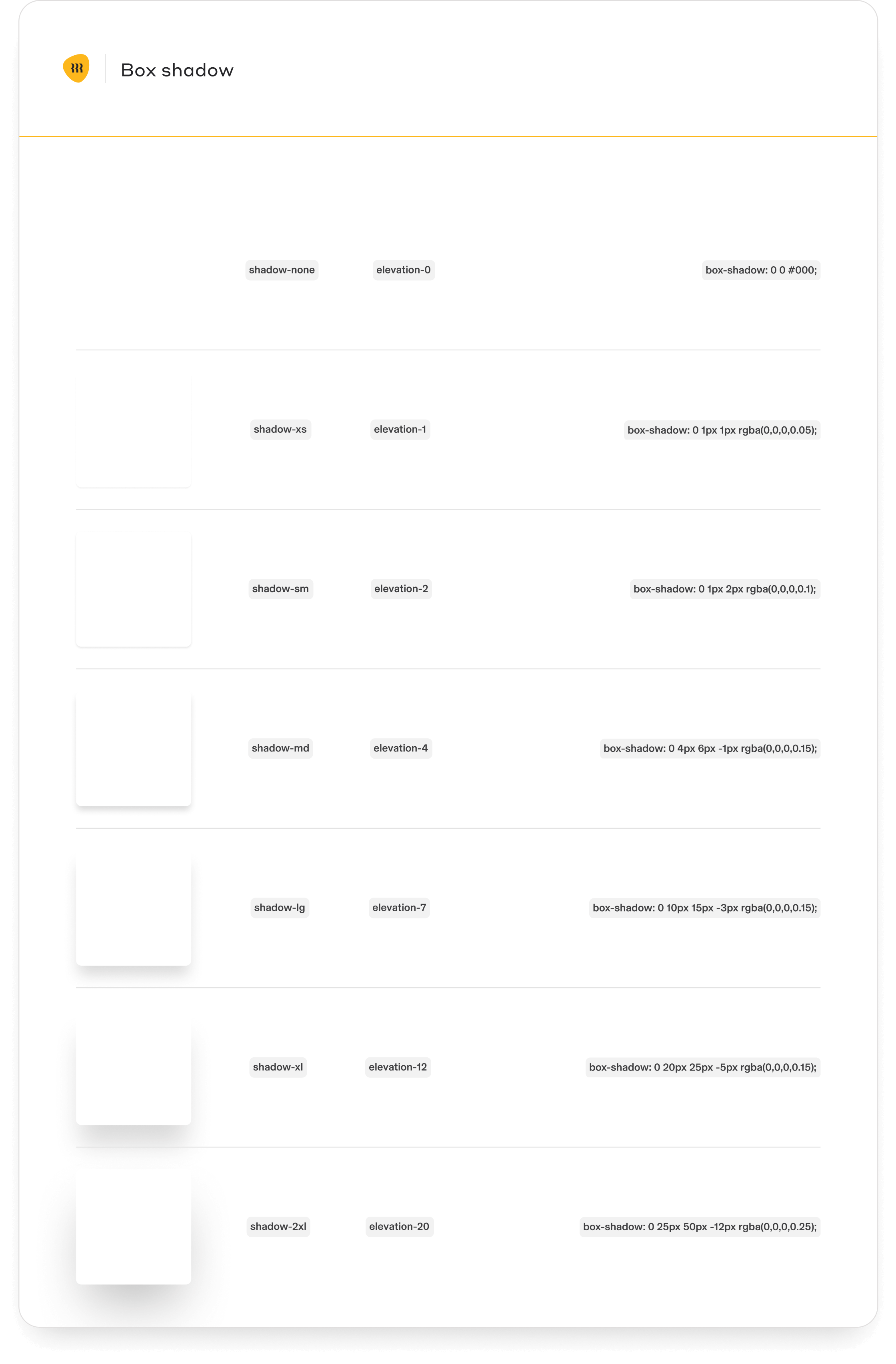
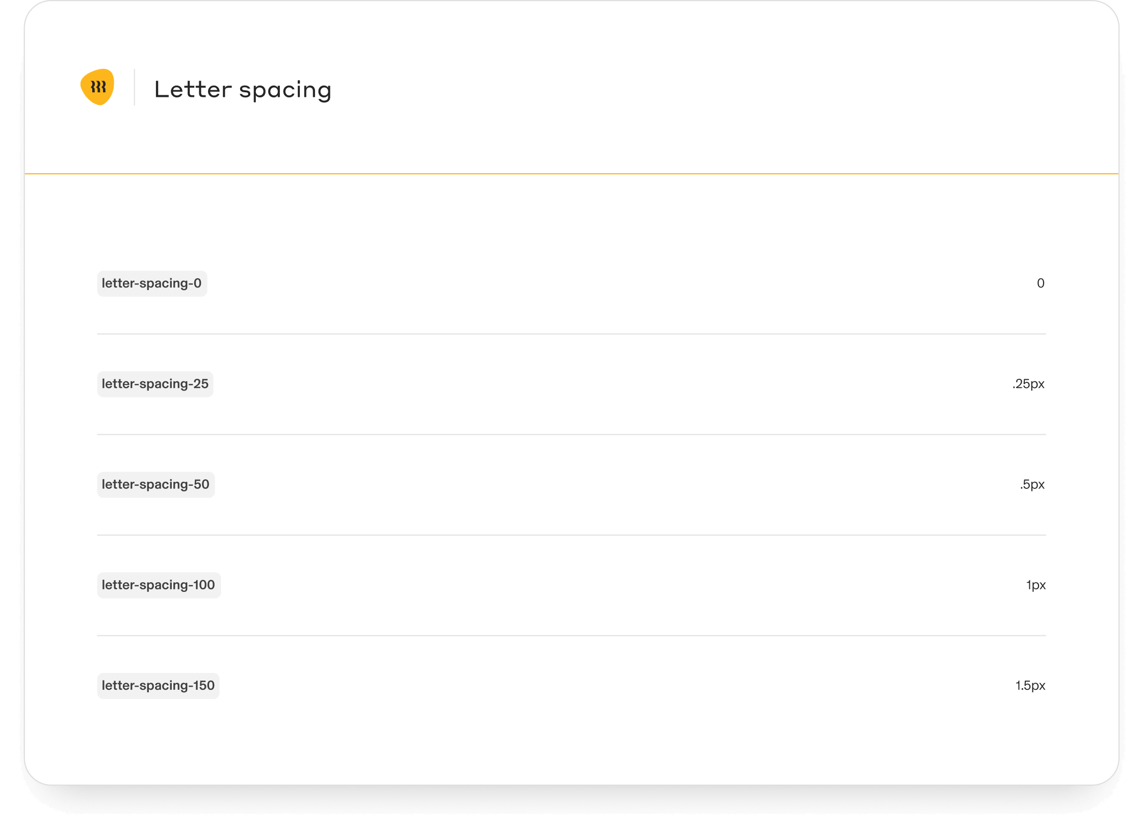
Core tokens
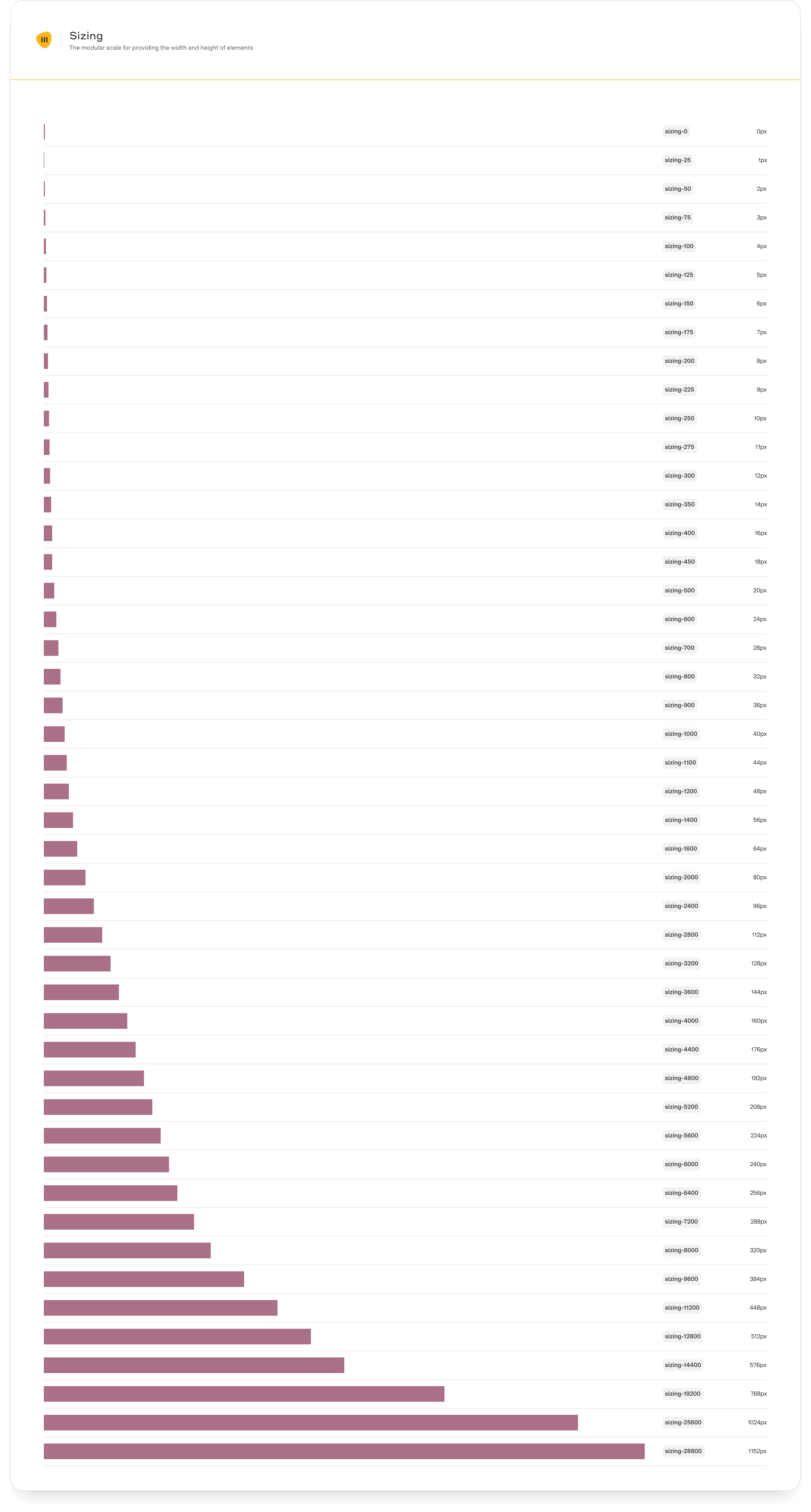
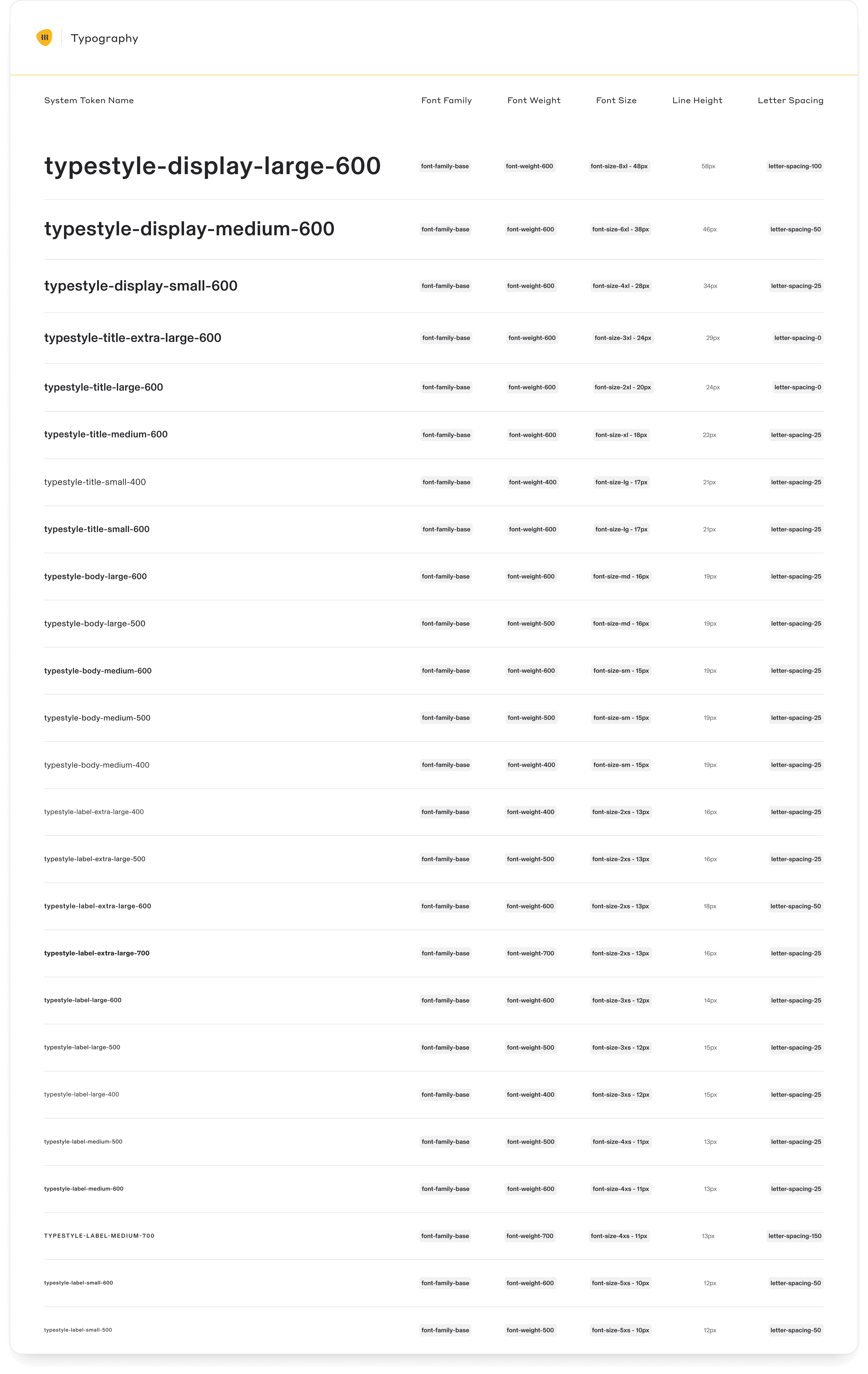
Alias tokens
The tokens are reused across all Figma files as variables. It became a shared language and a source of between design and code.
To update the tokens in code all we need to do is export the design token JSON file via the Design Token Figma plugin
To update the tokens in code all we need to do is export the design token JSON file via the Design Token Figma plugin
Figma variables
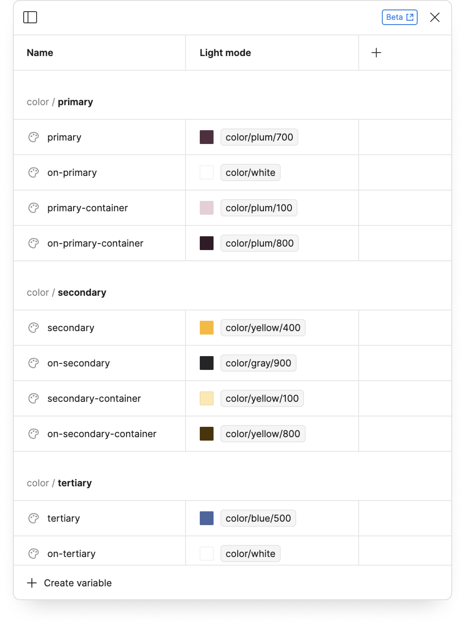
By introducing tokens as Figma variables we made sure product designers across different teams use the same values thus ending up with consistent designs across Figma and code.
Eliminating design guesswork with variables

In 2024 Rippling decided to change the visual direction globally. It started with the component library revamp.
Since the DS adoption at Rippling is very high this resulted in revamping all products at once with hardly any product team involvement.
Since the DS adoption at Rippling is very high this resulted in revamping all products at once with hardly any product team involvement.
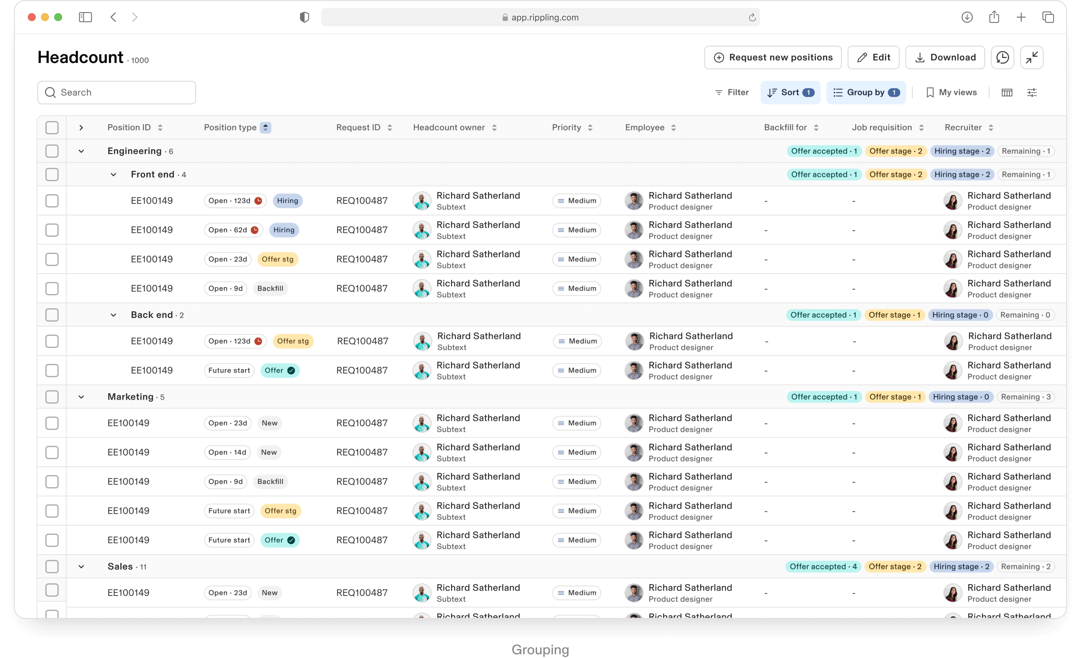
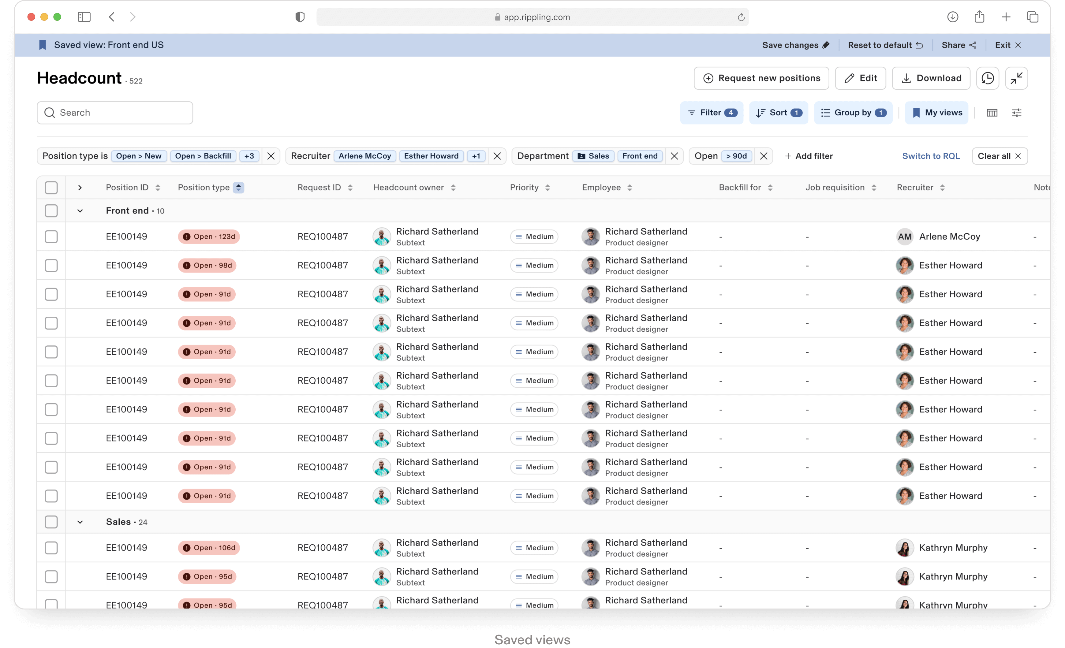
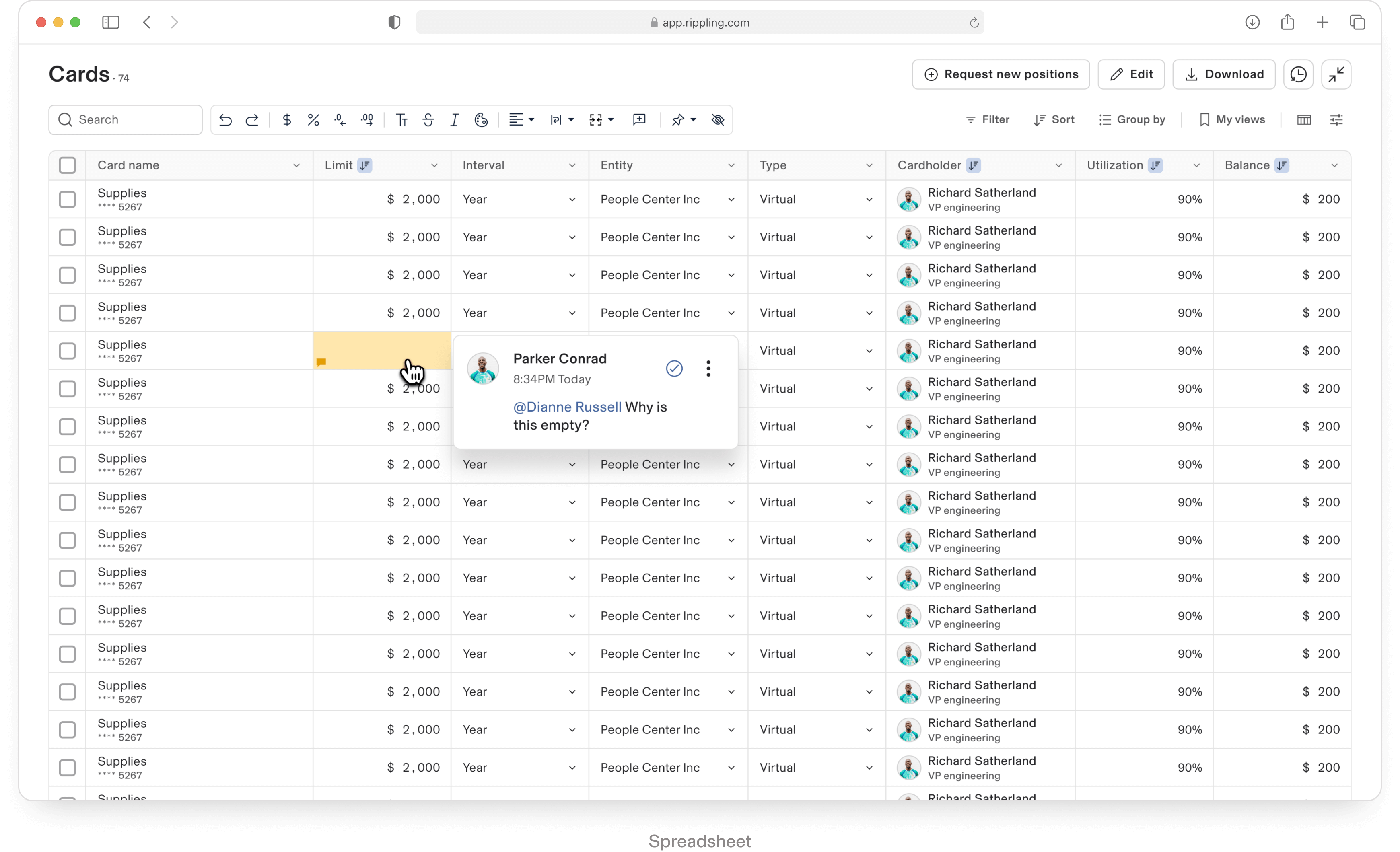
Component library revamp
The documentation provides essential guidelines for using and maintaining the components effectively.
Component library documentation and usage guidelines
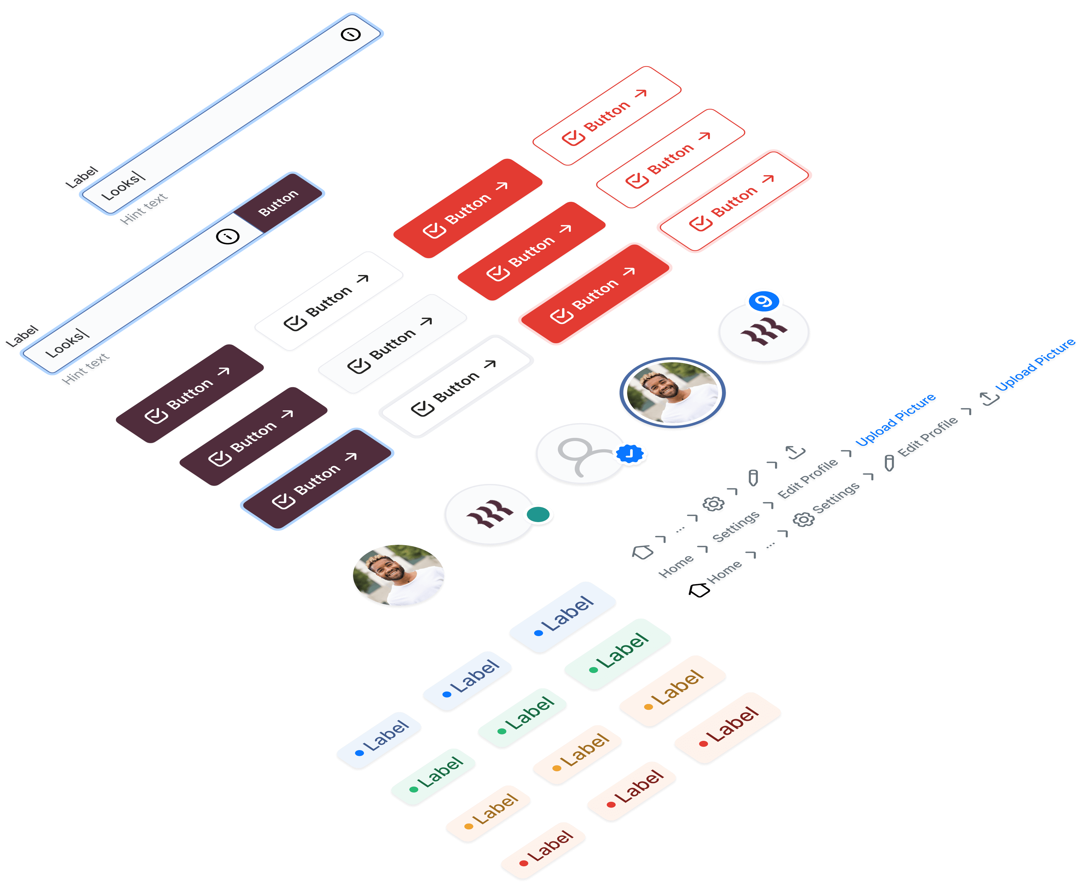
Rippling is a company that puts huge pressure on the design system with it’s humongous demand for new components, props, variants and general updates to satisfy all apps needs.
Flexible UI components
The system was designed with great level of flexibility to support various existing and future usecases for 20+ internal apps.
Flexible UI components
JSX is a syntax extension for JavaScript commonly used with React and React Native. It allows components to be customized and configured dynamically, making them more versatile and adaptable to different use cases.
Scalable UI Components
The design system is built to flex to all screen sizes across multiple platforms and OS’s.
Built-in responsiveness
For product designers, these pre-built interactions streamline the prototyping process, allowing for quicker, more consistent, and engaging prototypes directly within Figma.
Built-in micro interactions
Accessibility starts with design. The goal was to meet WCAG 2.1 AA standards. Patterns like text sizes, color contrast ratios, keystrokes navigation rules etc. were designed and implemented in code to make sure the product is accessible for disabled people.
Accessibility
Motion can bring your digital experience to life. It can really help you as a designer to build guided experience with some great story telling. Use Pebble motion to create micro interactions, rhythmic patterns and creating visual cheorographies
Motion tokens
and documentation
and documentation
Stan came up with Figma template that eliminates a lot of back and forth between engineering and design on the hand over, implementation, and QA stages.
Both teams agreed on specific deliverables for design specs and implementation, streamlining collaboration between design and front-end. This approach melted the ice and killed lots of guesswork between the teams achieving a positive culture where nobody hates their job and appreciates each other.
Both teams agreed on specific deliverables for design specs and implementation, streamlining collaboration between design and front-end. This approach melted the ice and killed lots of guesswork between the teams achieving a positive culture where nobody hates their job and appreciates each other.
Mitigating tension between design and engineering
design hand over template
Monster components
3.0
Confidential | May 2023
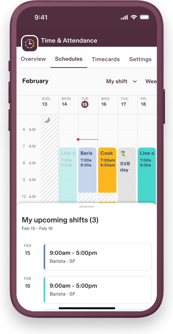
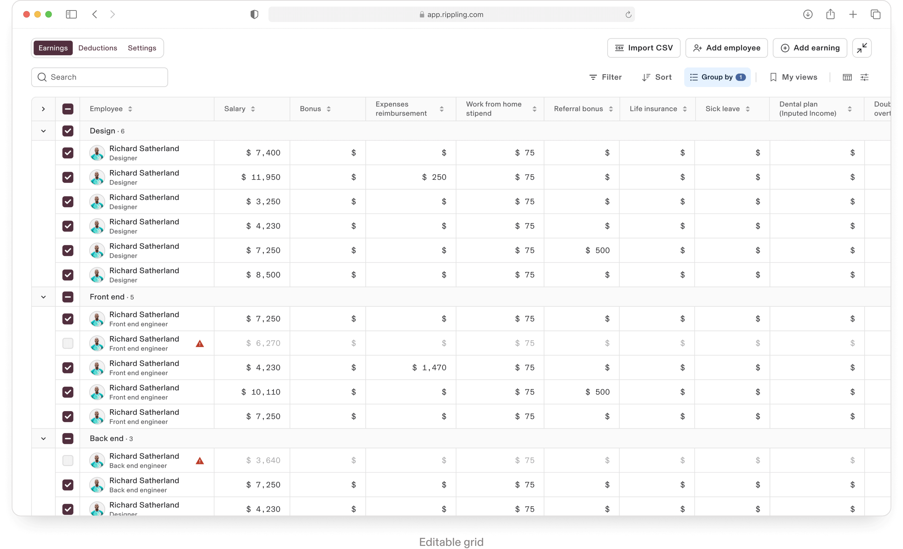
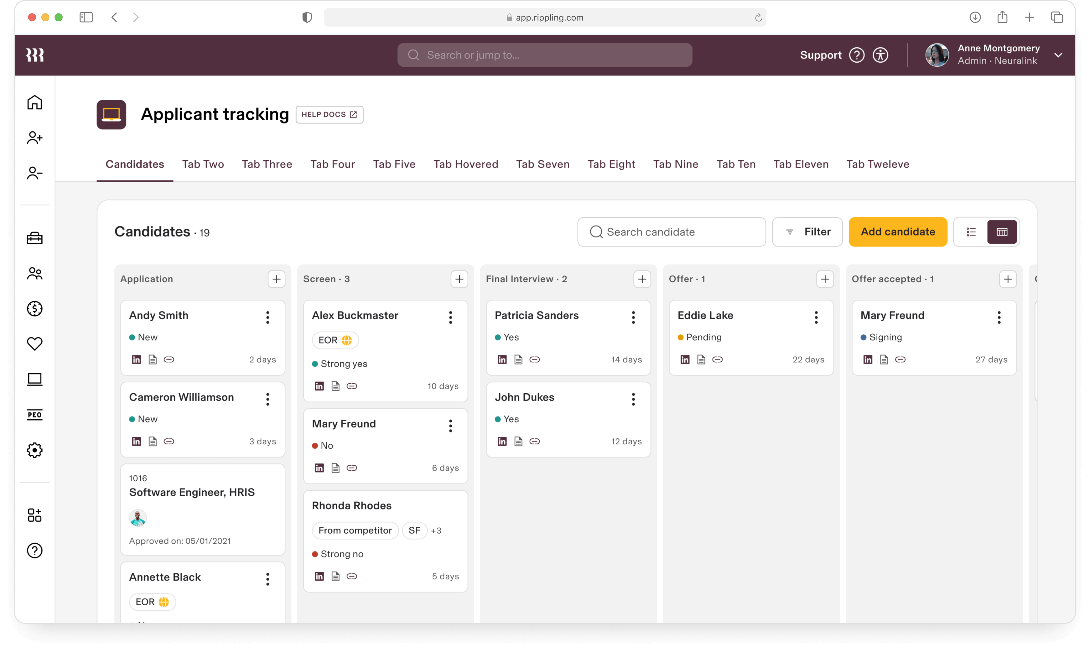
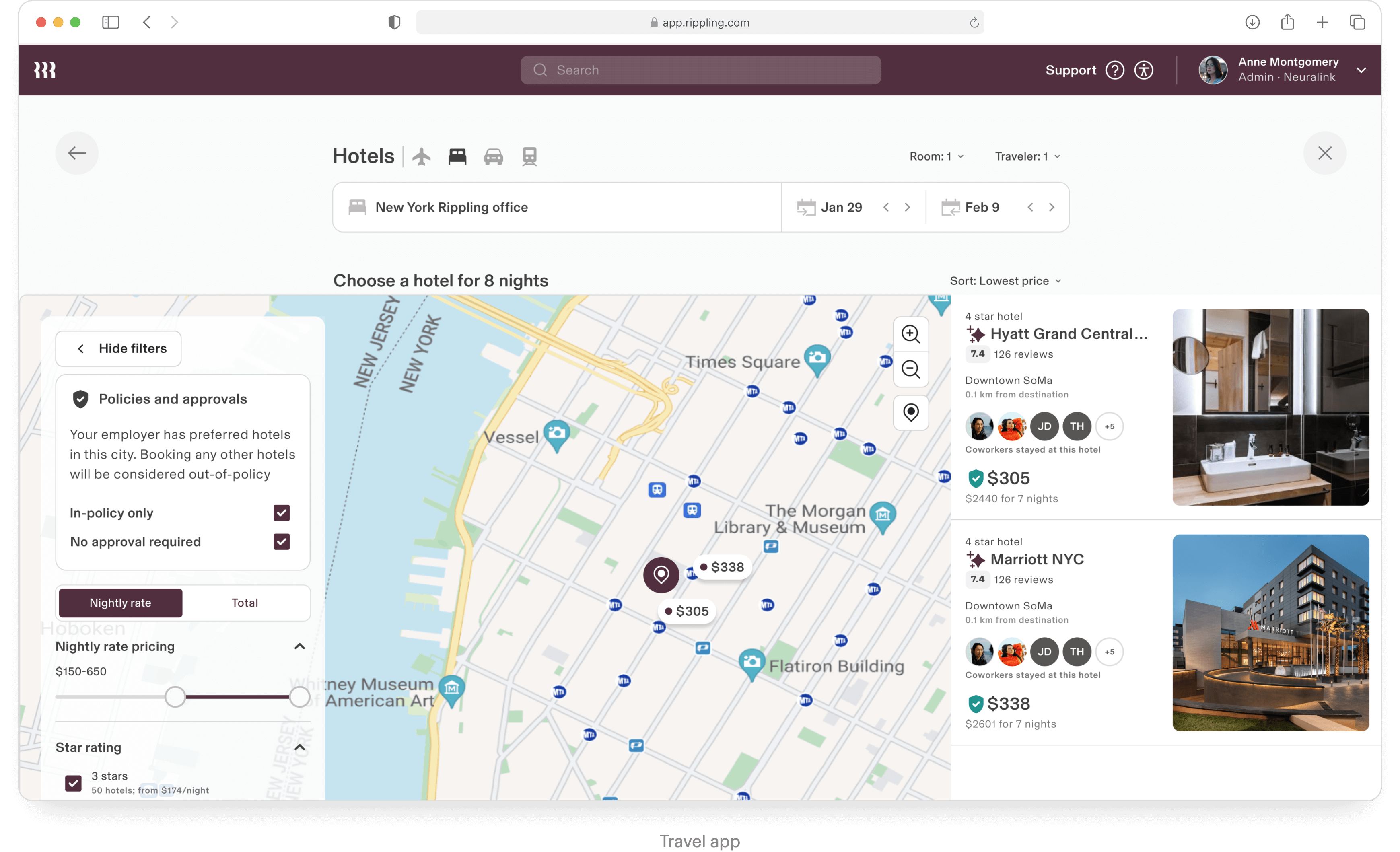
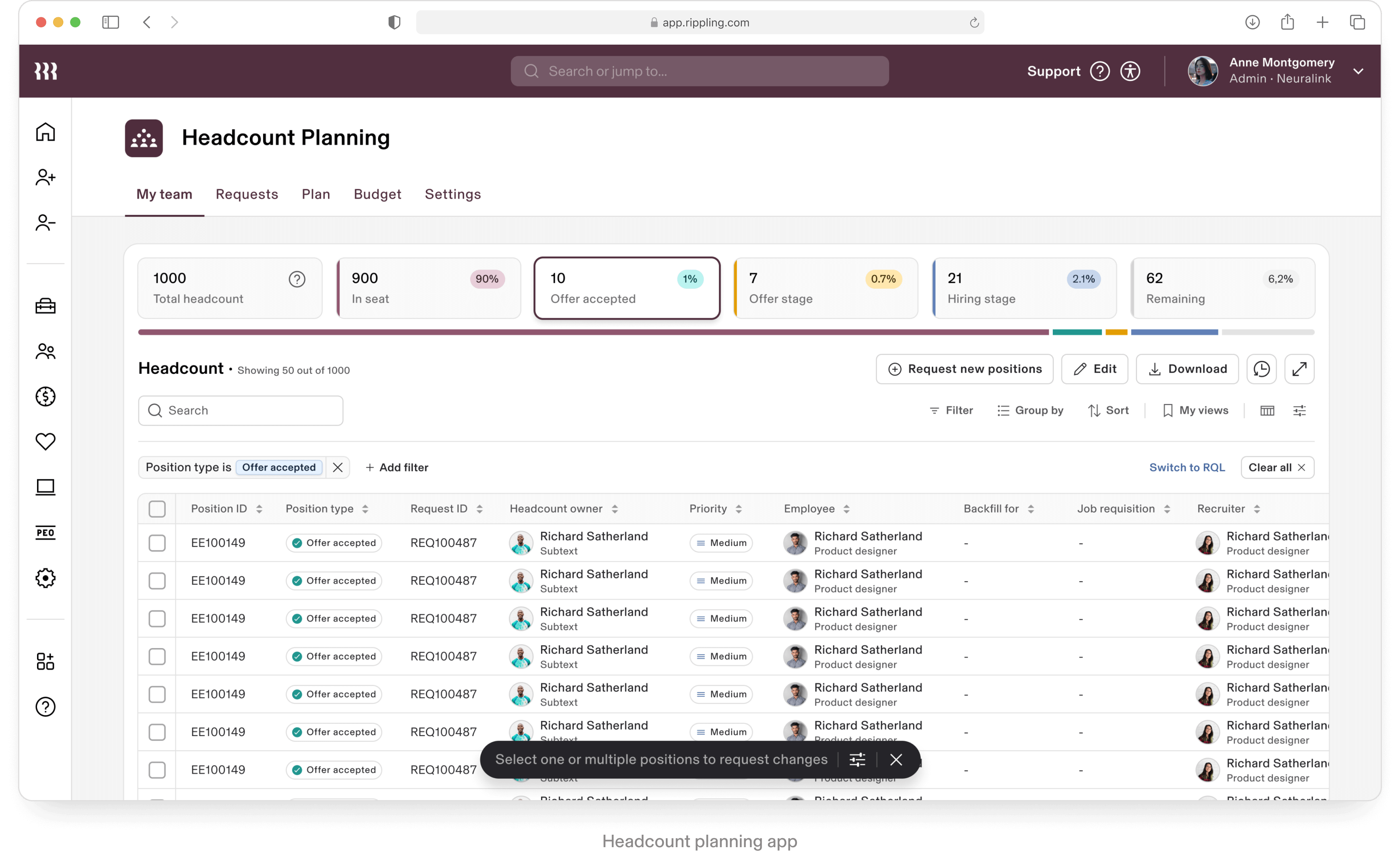
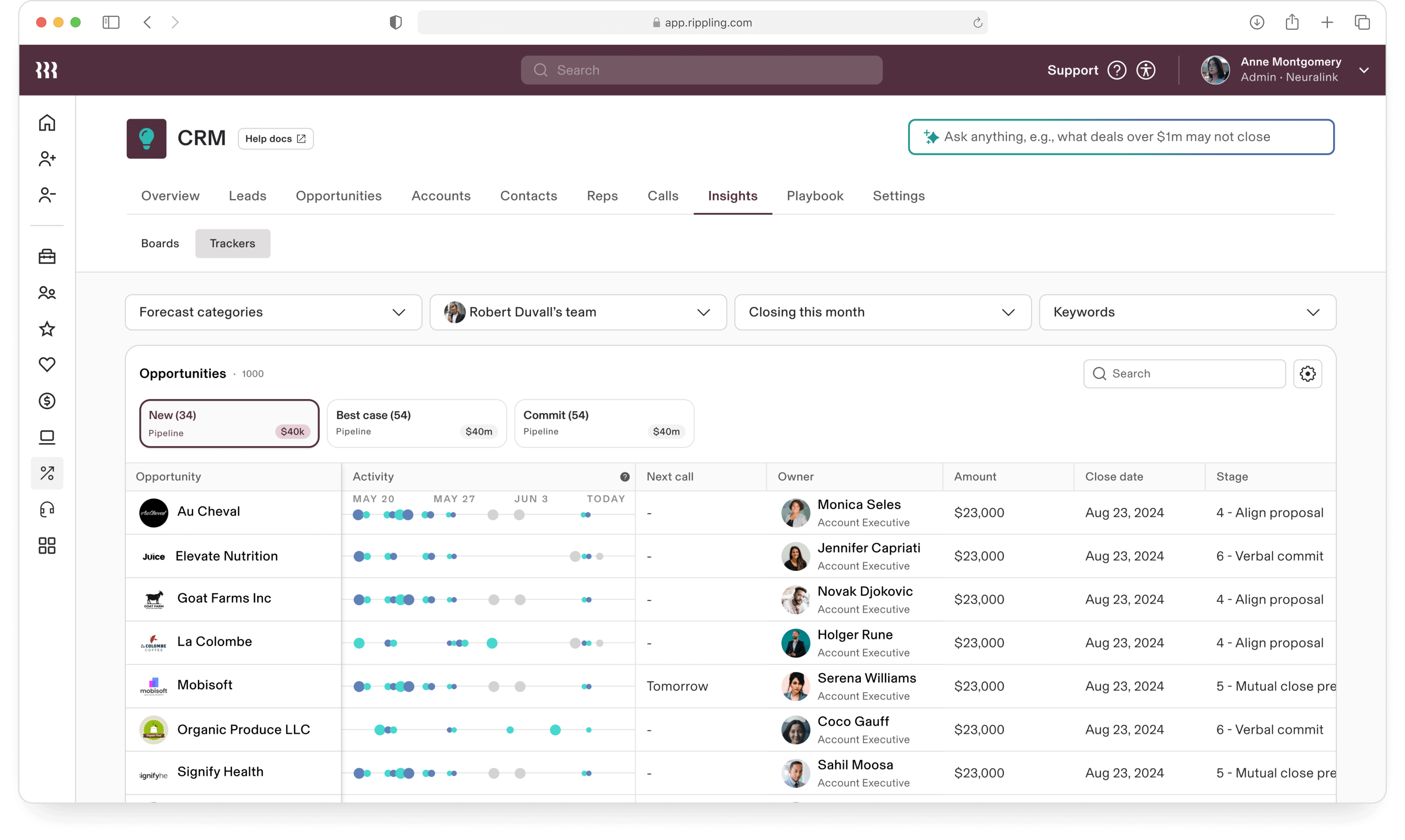
Table is a crucial component for Rippling. The fact that it’s used on 90% of the product screens speaks for it’s importance and UX value for the company.
In 2024 Stan faced a challenge to redesign the Table component from the ground up.
Given Rippling’s diverse multi-app requirements for the Table, the UX complexity for this component alone could be compared to AirTable and similar table-oriented products.
In 2024 Stan faced a challenge to redesign the Table component from the ground up.
Given Rippling’s diverse multi-app requirements for the Table, the UX complexity for this component alone could be compared to AirTable and similar table-oriented products.
Data grid table
Monster components
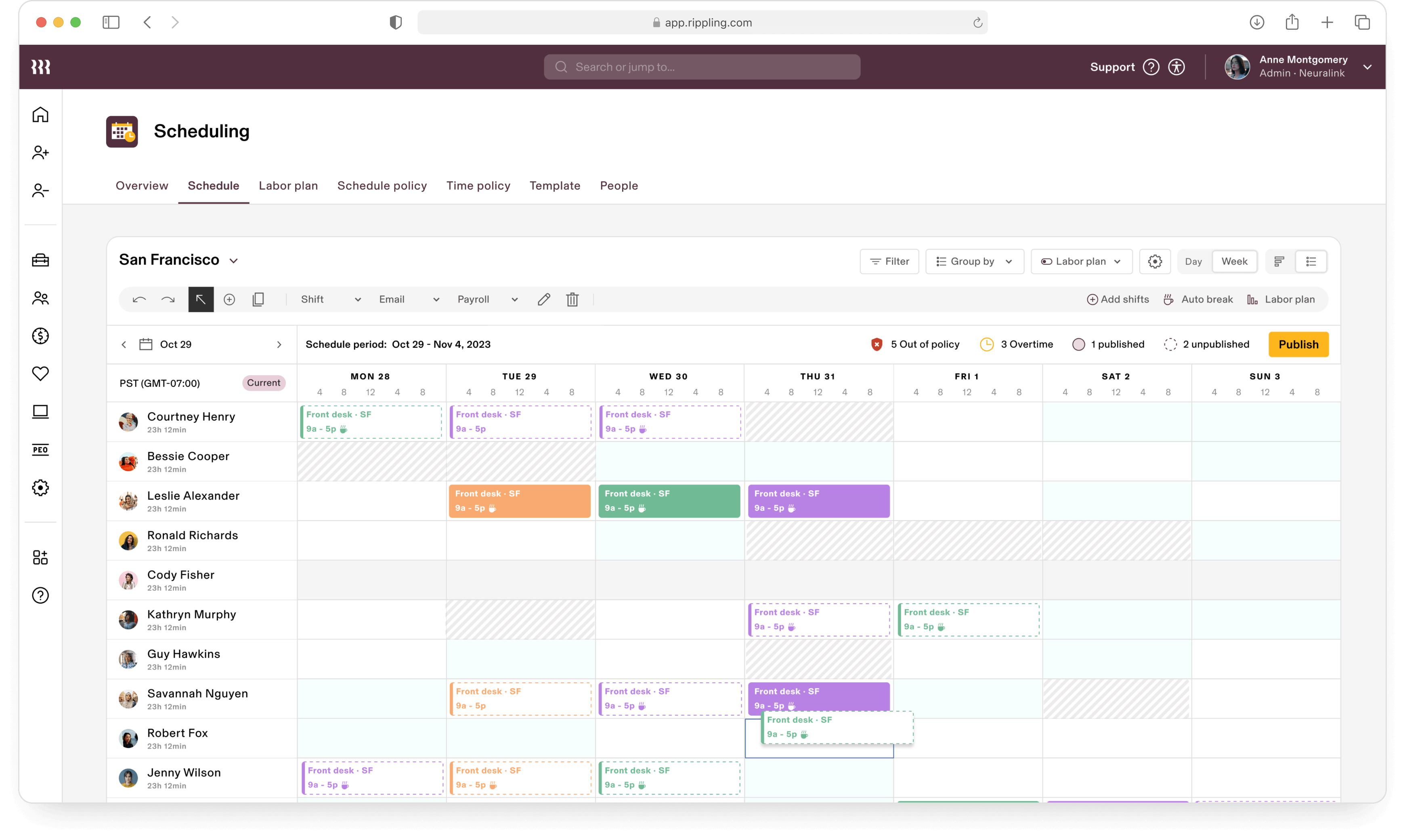
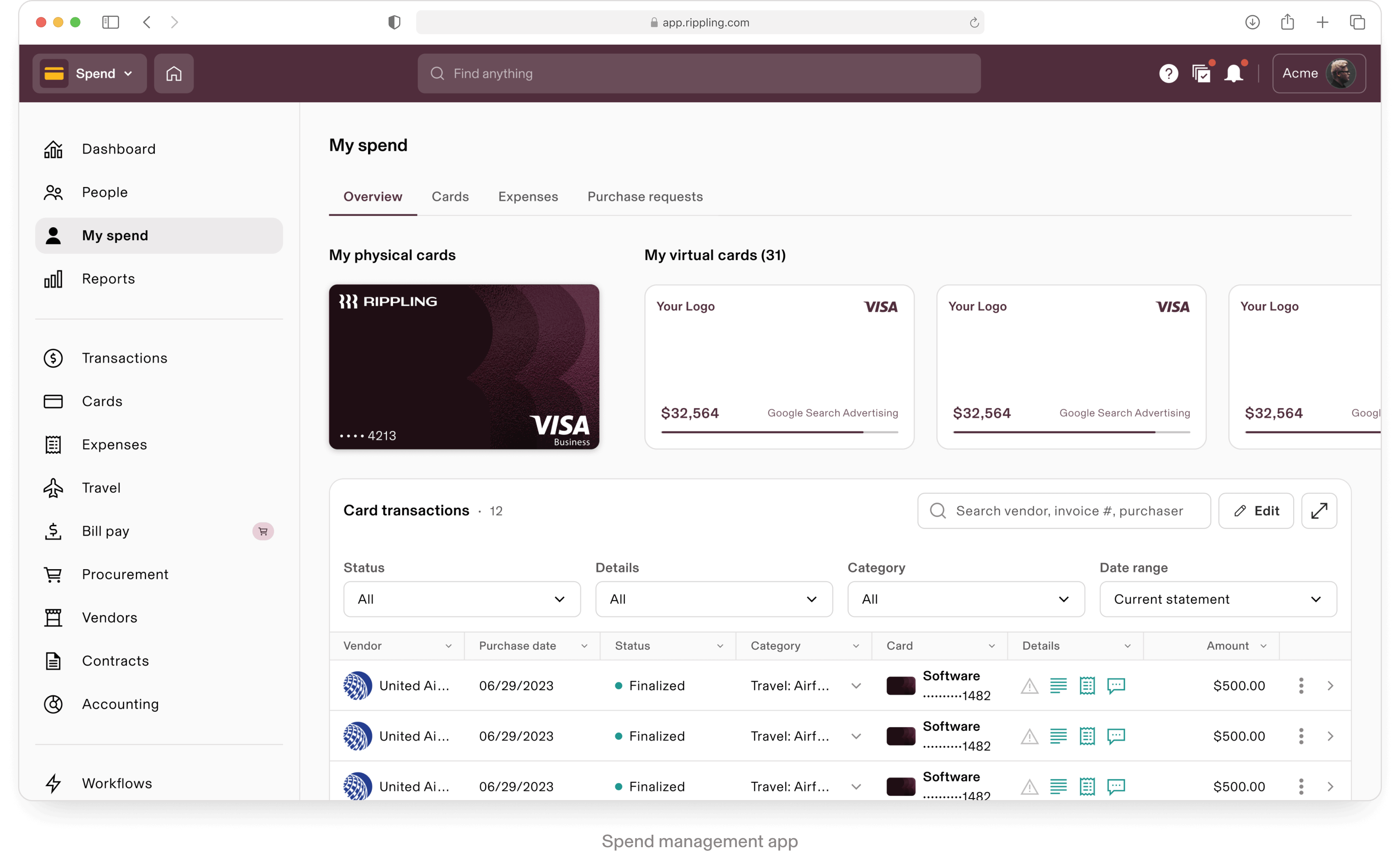
The complexity of a Kanban board as a design system component lies in balancing robust functionality with ease of use. It supports features like task visualization, customization, and automation while ensuring a seamless, responsive experience across devices.
Integration with other tools through APIs and maintaining accessibility further add to its intricacy, requiring thoughtful design to ensure performance and reliability.
Integration with other tools through APIs and maintaining accessibility further add to its intricacy, requiring thoughtful design to ensure performance and reliability.
Kanban board
Monster components
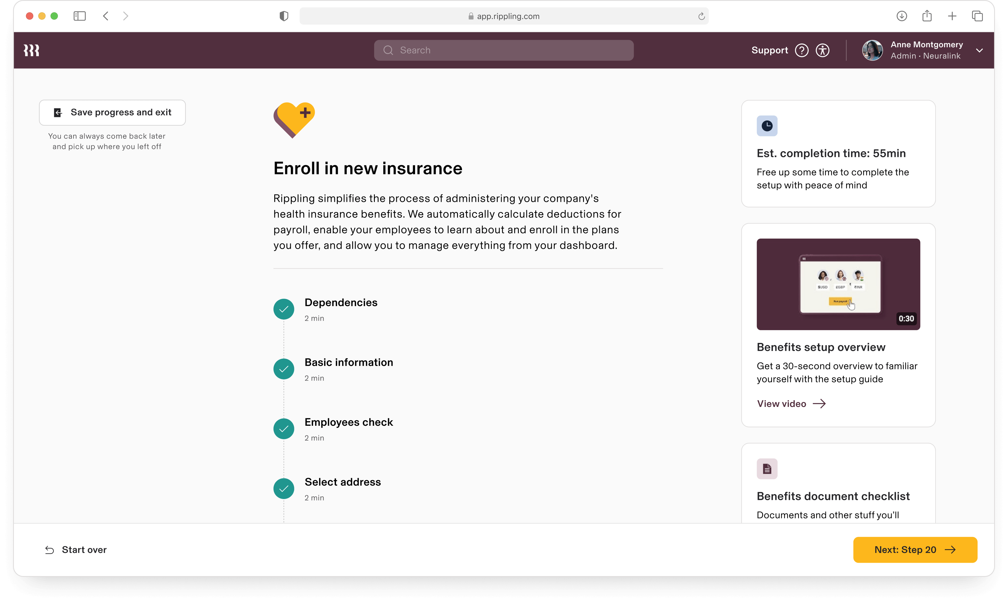
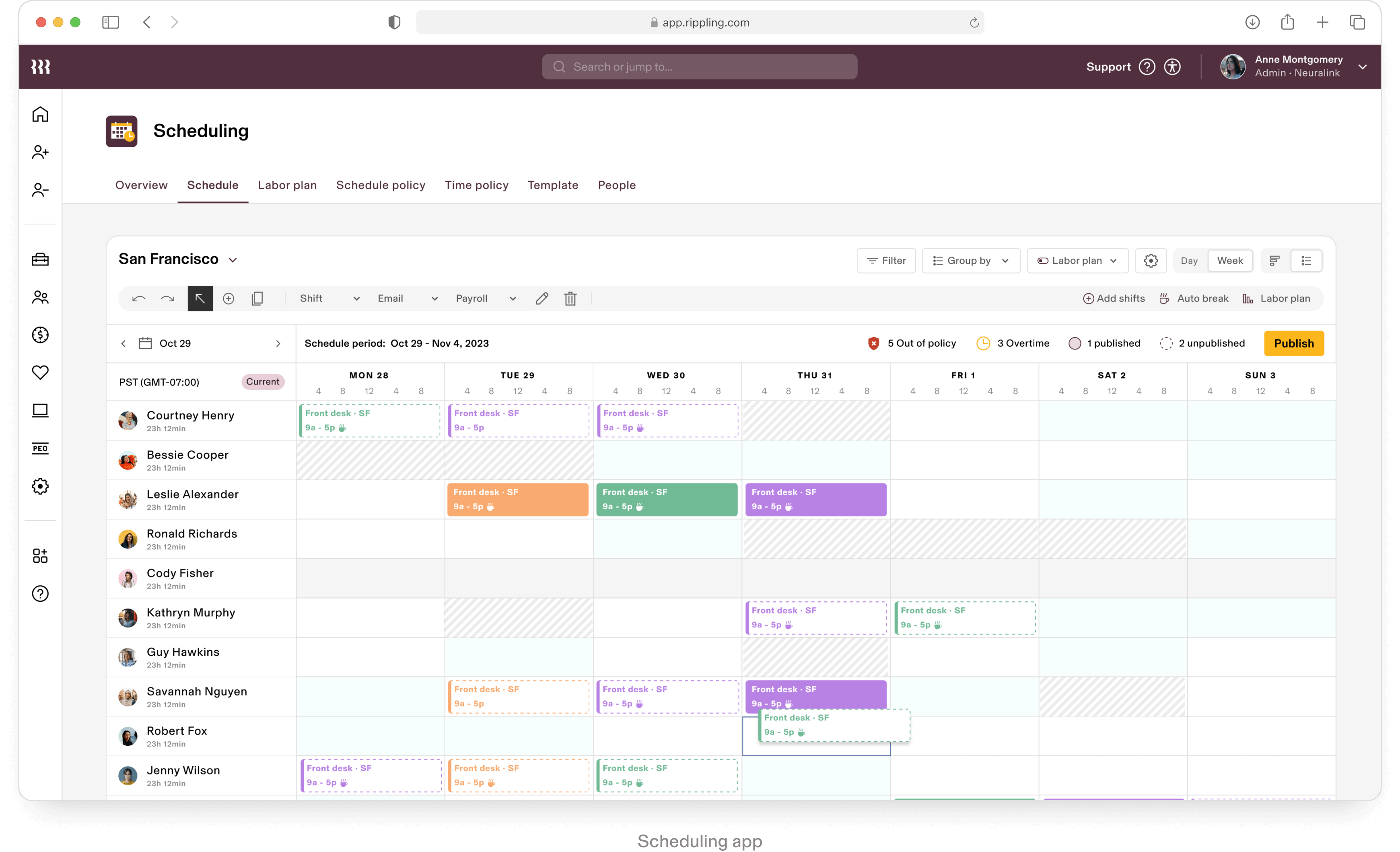
This component involves supporting diverse functionalities like event creation, recurring appointments, time zone adjustments, and reminders. It must integrate with other calendars via APIs for real-time sync and handle scheduling conflicts, notifications, and data security.
Additionally, ensuring accessibility through features like keyboard navigation and screen reader compatibility adds to the complexity, making it a multifaceted component to design and maintain.
Additionally, ensuring accessibility through features like keyboard navigation and screen reader compatibility adds to the complexity, making it a multifaceted component to design and maintain.
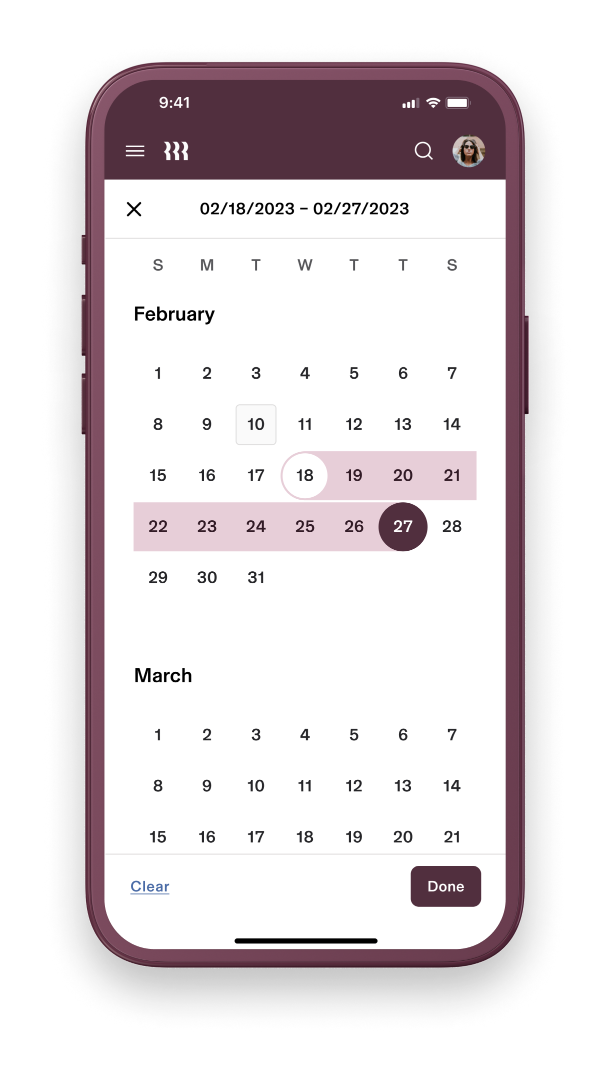
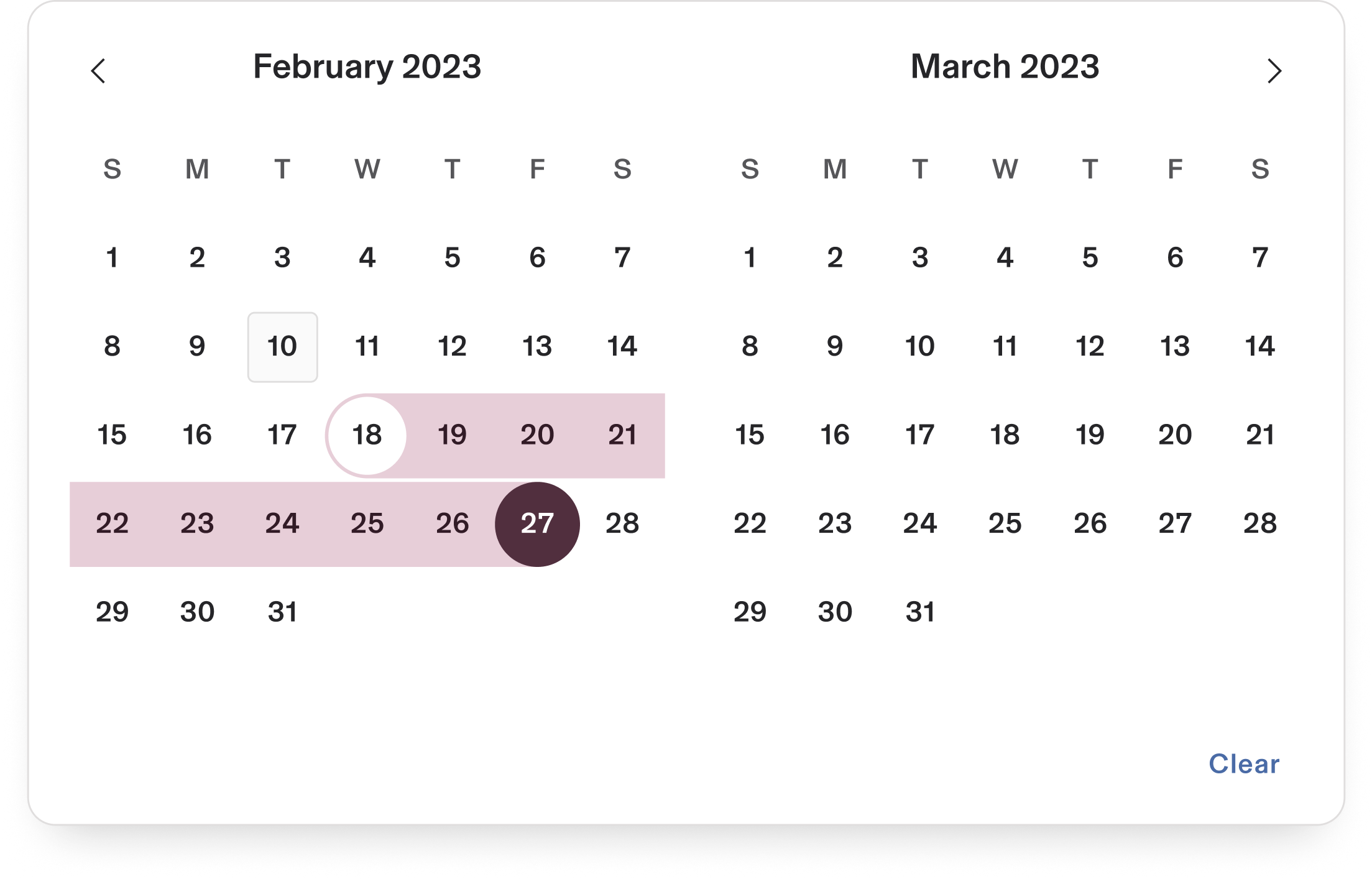
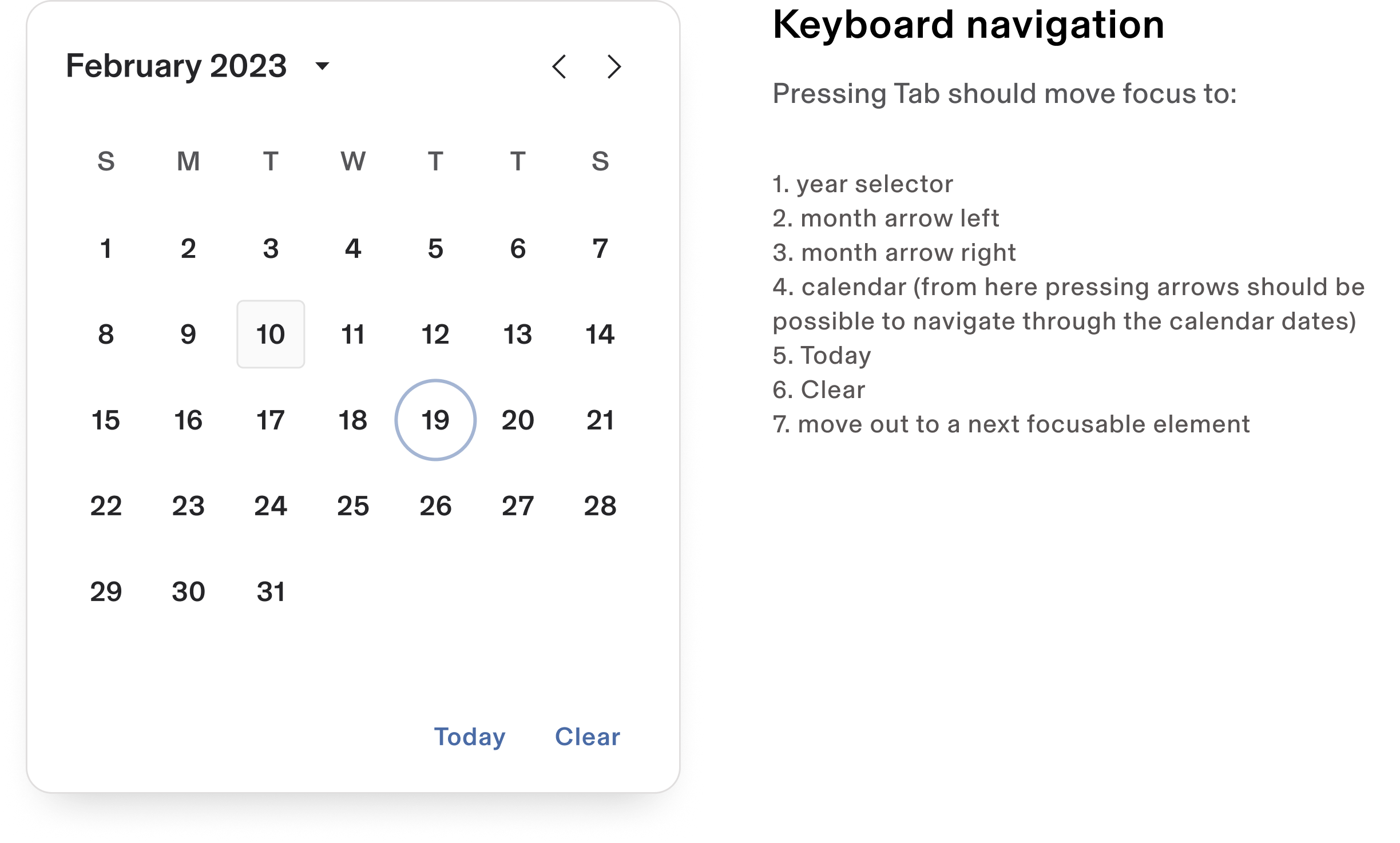
Scheduling calendar
Monster components
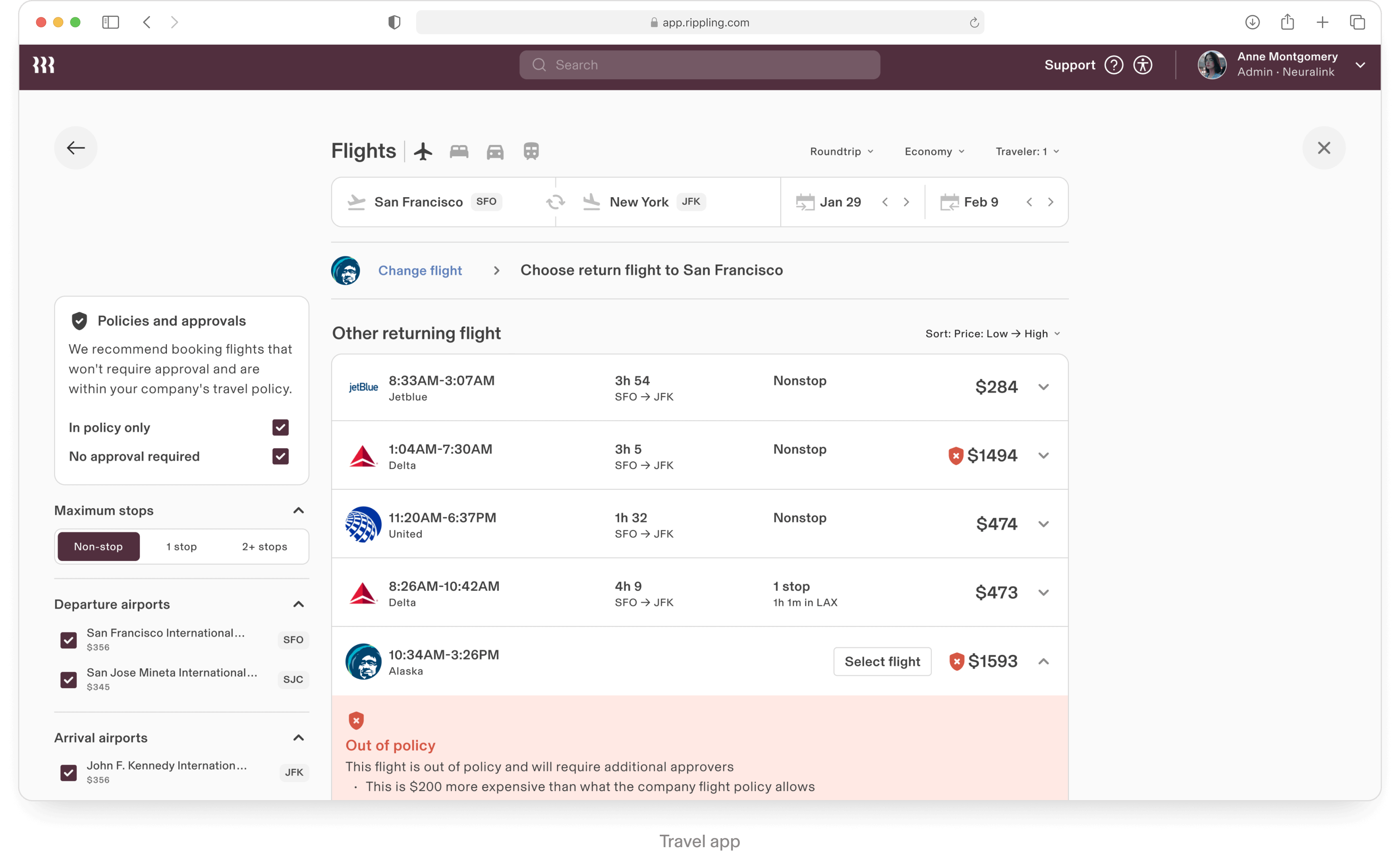
This component involves supporting diverse functionalities like event creation, recurring appointments, time zone adjustments, and reminders. It must integrate with other calendars via APIs for real-time sync and handle scheduling conflicts, notifications, and data security.
Additionally, ensuring accessibility through features like keyboard navigation and screen reader compatibility adds to the complexity, making it a multifaceted component to design and maintain.
Additionally, ensuring accessibility through features like keyboard navigation and screen reader compatibility adds to the complexity, making it a multifaceted component to design and maintain.
Flow component
Monster components
Impact and results
2.0
Confidential | May 2023
Future plans
2.0
Confidential | May 2023
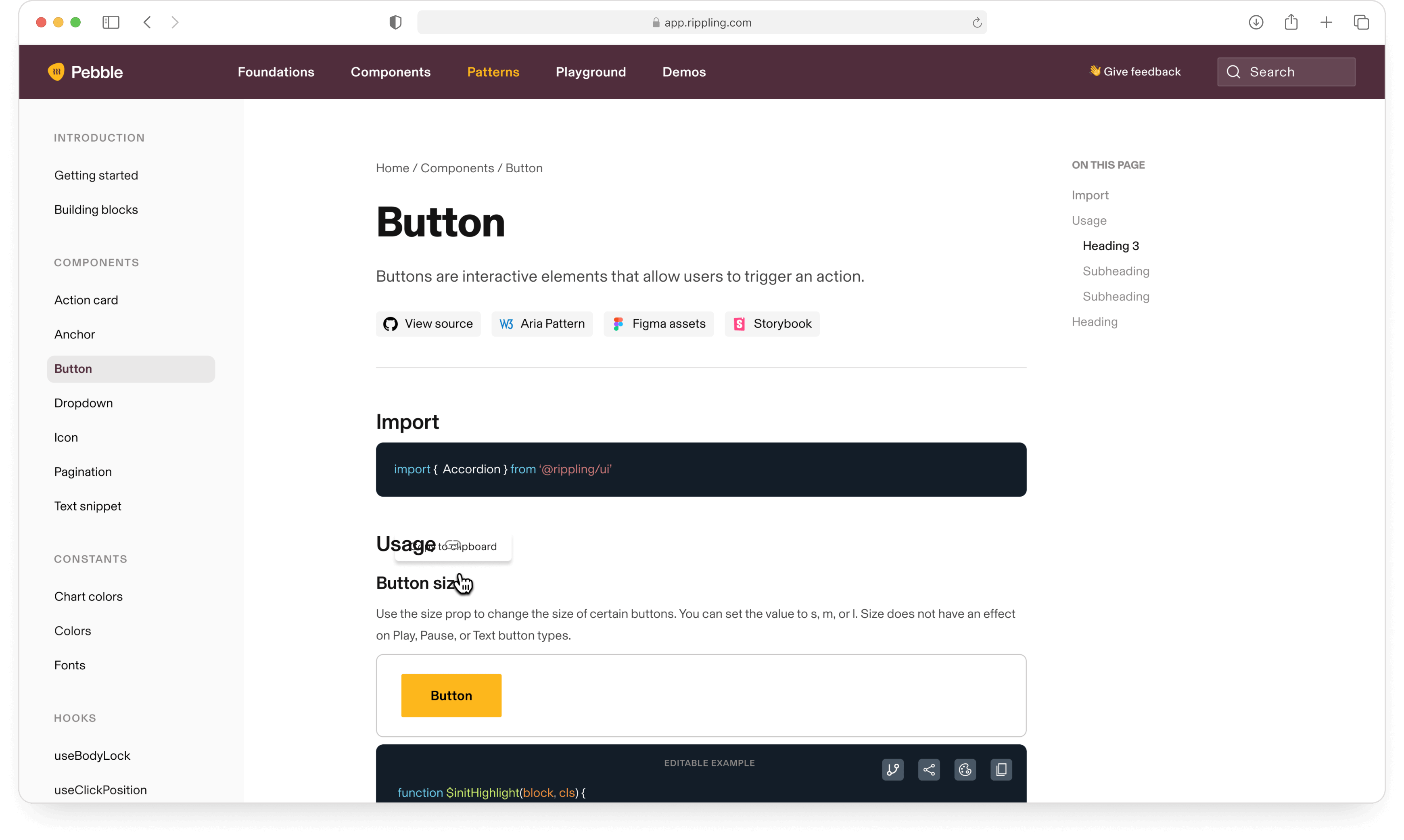
Pebble website is crucial for Rippling because it ensures consistency, efficiency, and scalability across all its products and services. By centralizing design guidelines, components, and best practices, the website enables designers and developers to work cohesively, reducing duplication of effort and maintaining a unified brand experience.
Pebble fosters collaboration, accelerates the development process, and ensures that the user interface is intuitive and aligned with Rippling's brand identity, ultimately enhancing the user experience and supporting the company's growth.
Pebble fosters collaboration, accelerates the development process, and ensures that the user interface is intuitive and aligned with Rippling's brand identity, ultimately enhancing the user experience and supporting the company's growth.
Design system website
Looking ahead, we plan to
Integrating AI into search functionality is vital for Rippling because it enhances the ability to deliver personalized, relevant, and efficient results for users. AI-driven search can understand context, learn from user behavior, and adapt to provide more accurate and meaningful outcomes, whether it's for finding specific employee information, navigating HR resources, or managing workflows.
Integrate AI
Looking ahead, we plan to
Existing global nav design encourages us to create higher numbers of smaller apps. This makes it difficult to offer cohesive experiences for standalone customers of one vertical (e.g. IT / Spend).
The redesign proposal emphasizes a focus on in-app navigation, more singular app experiences that allow more functionality on a single pane of glass, and a consistent focus on platform concepts inside apps.
The redesign proposal emphasizes a focus on in-app navigation, more singular app experiences that allow more functionality on a single pane of glass, and a consistent focus on platform concepts inside apps.
Navigation redesign
Looking ahead, we plan to


